Client
Historic Houses
Studio
Johnson Banks
Disciplines
Brand identity
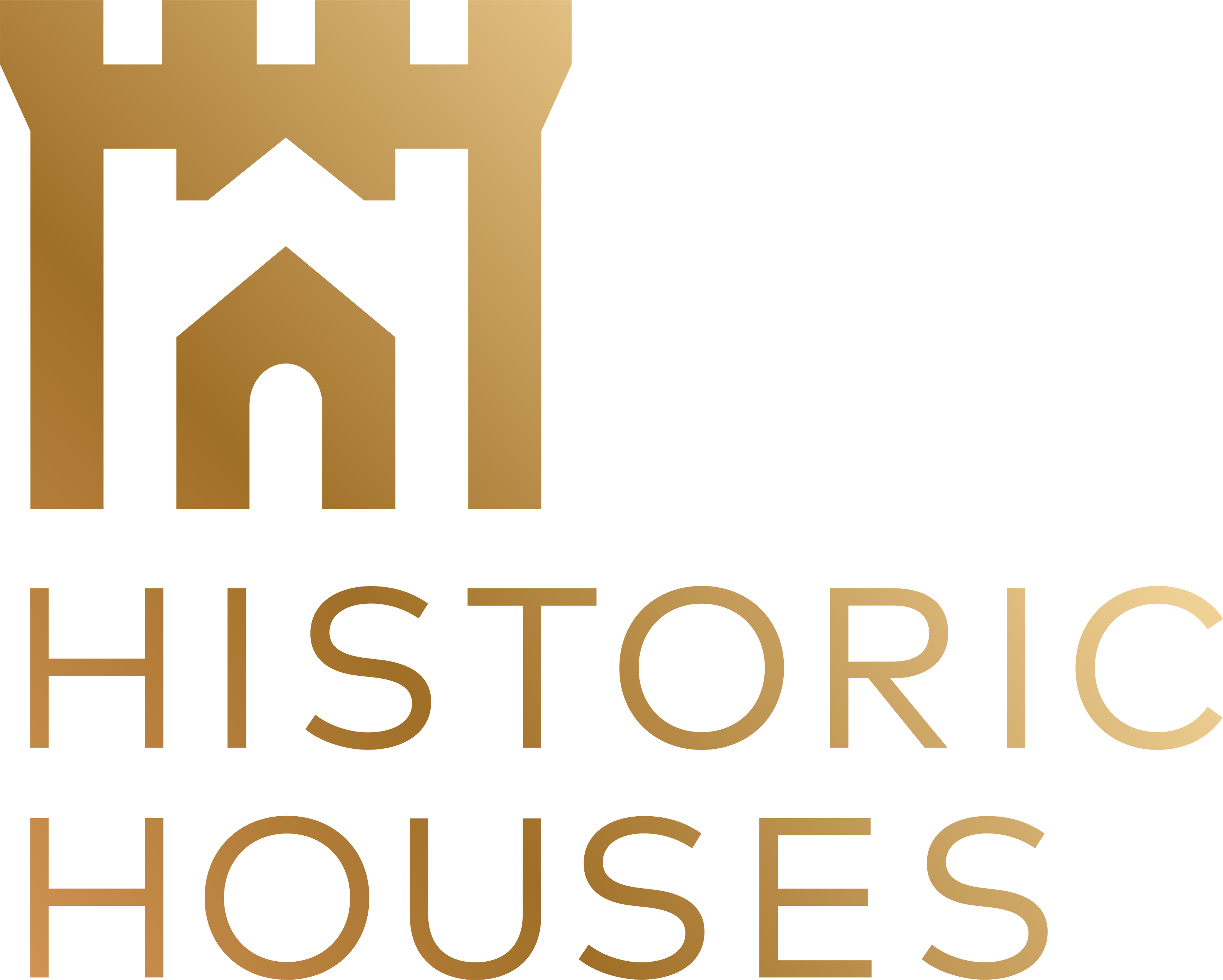
Logo design
Campaigns and advertising
Print design
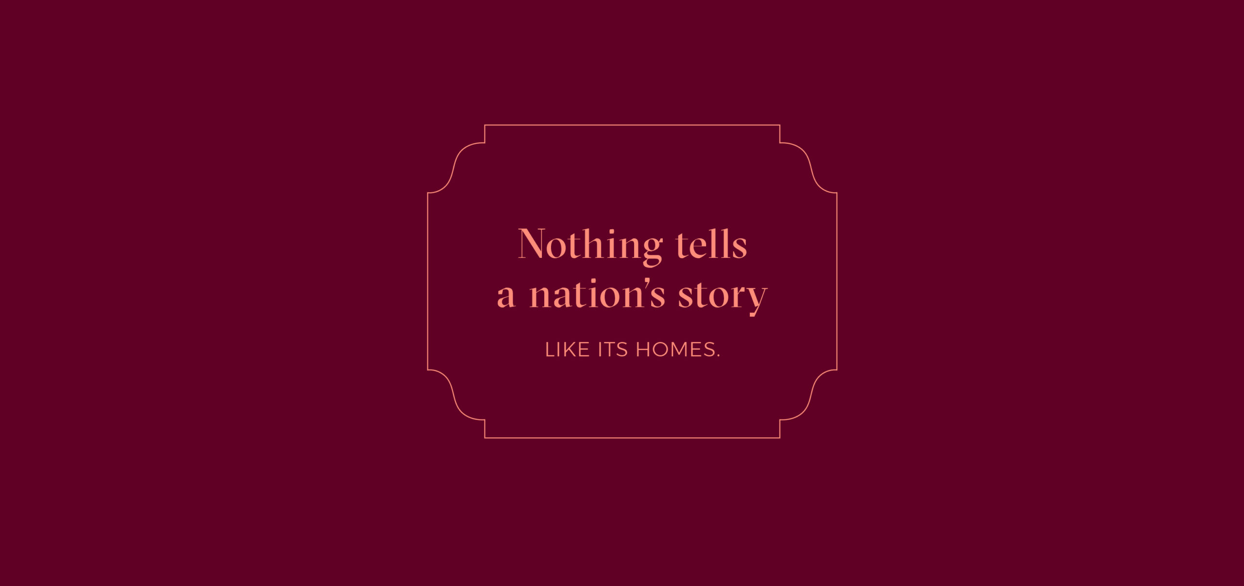
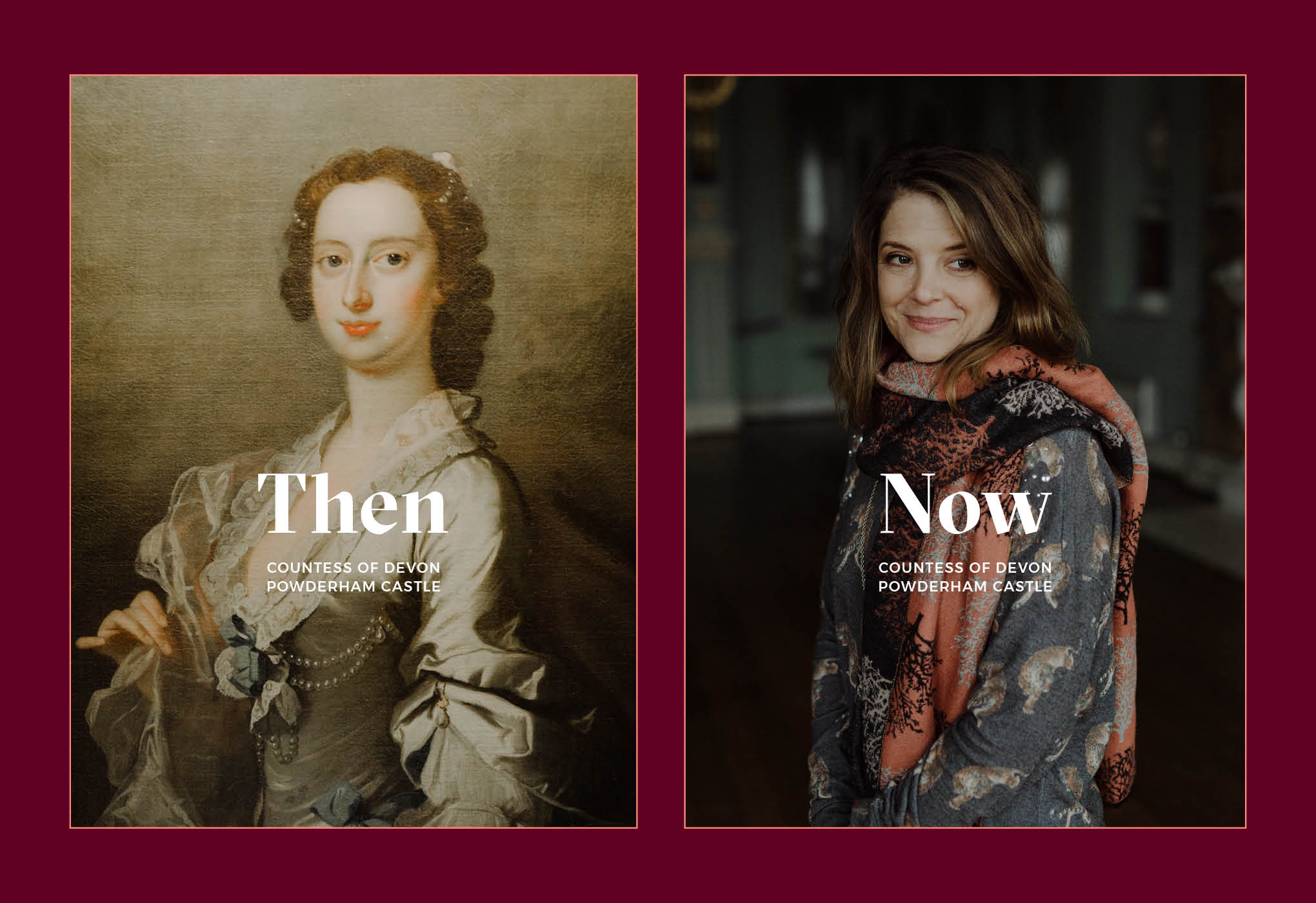
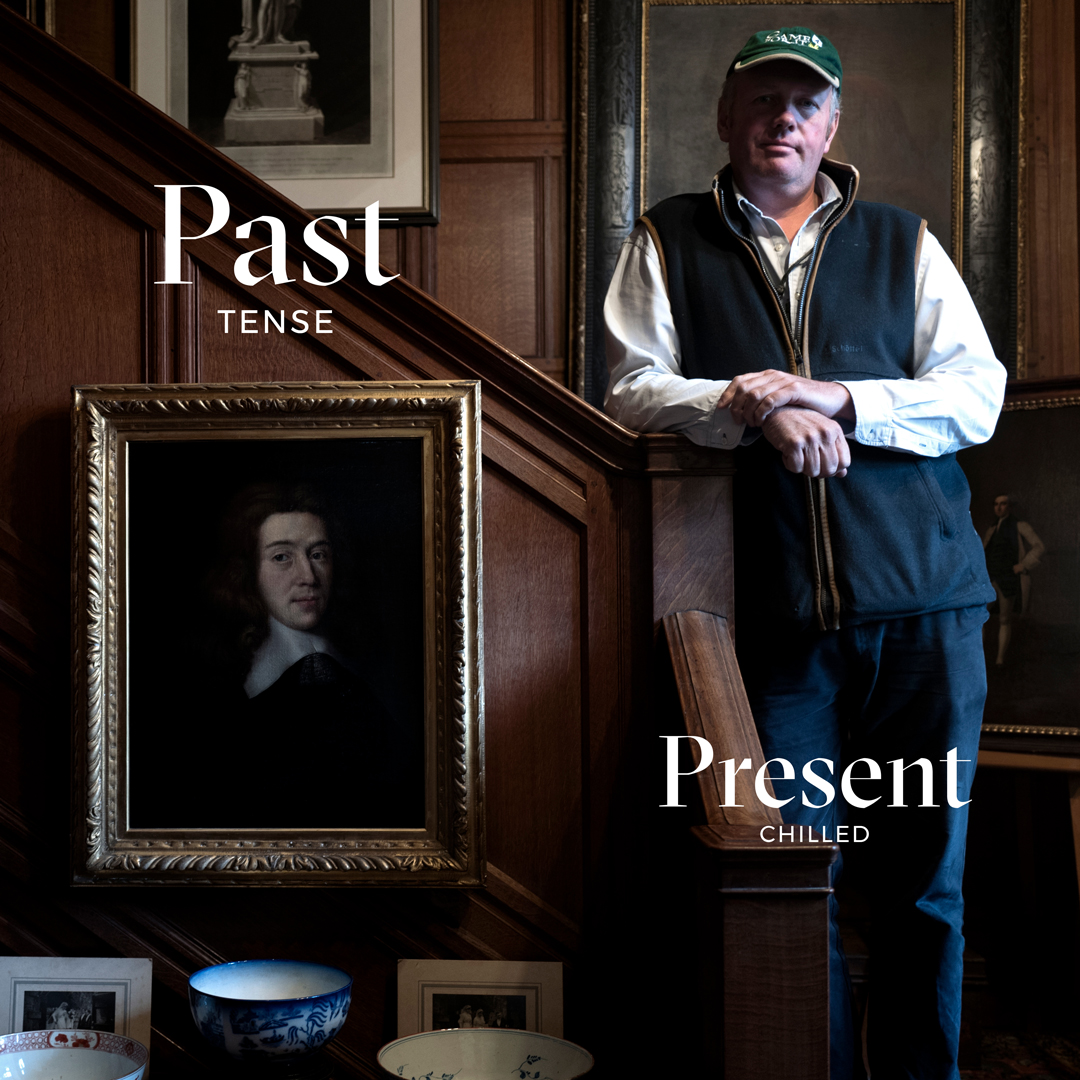
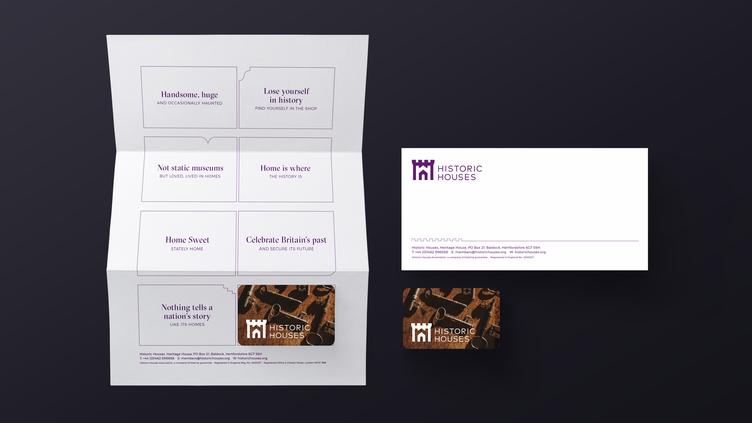
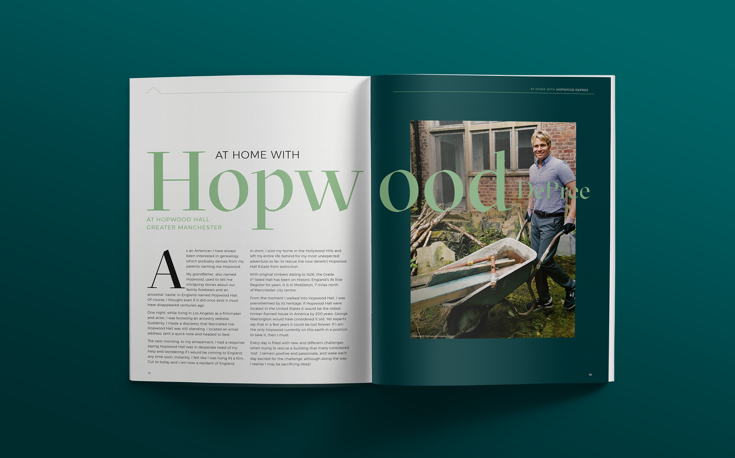
Nothing tells a nation's story,
like it's homes.
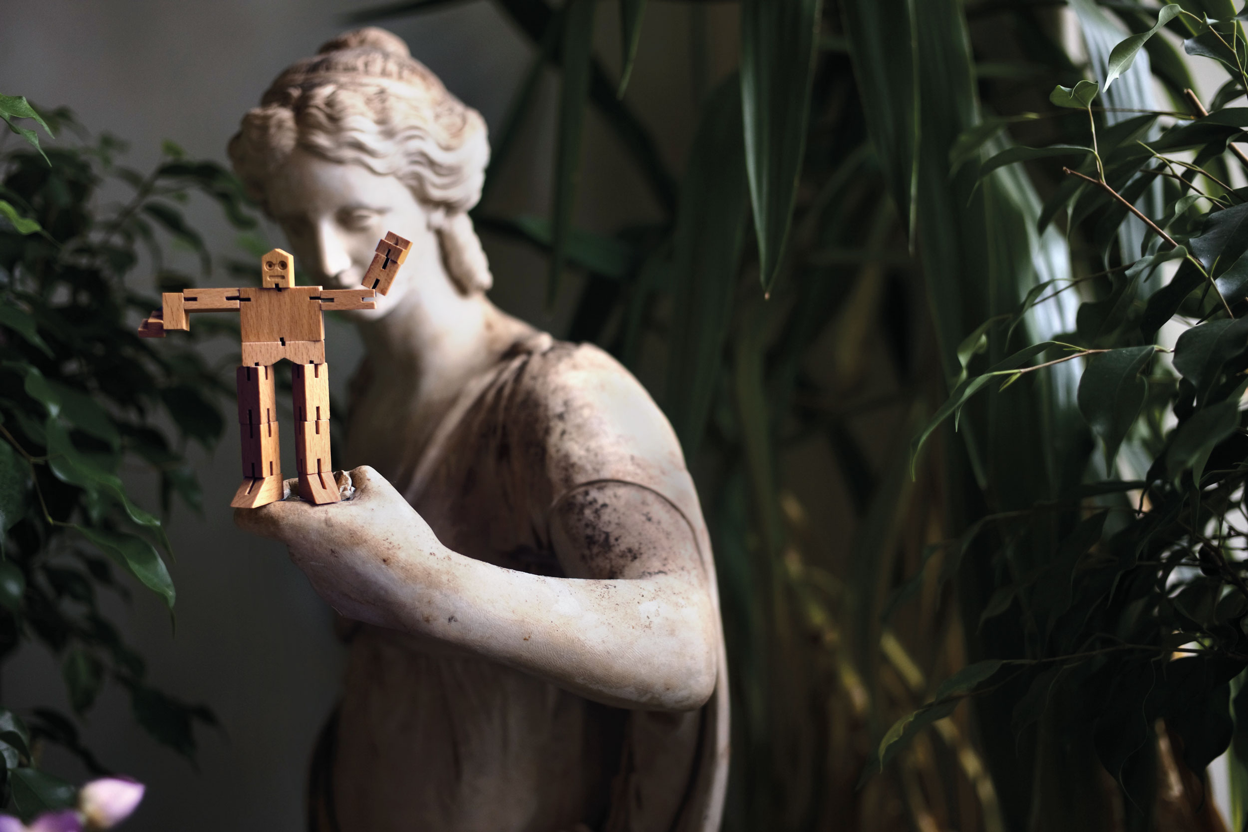
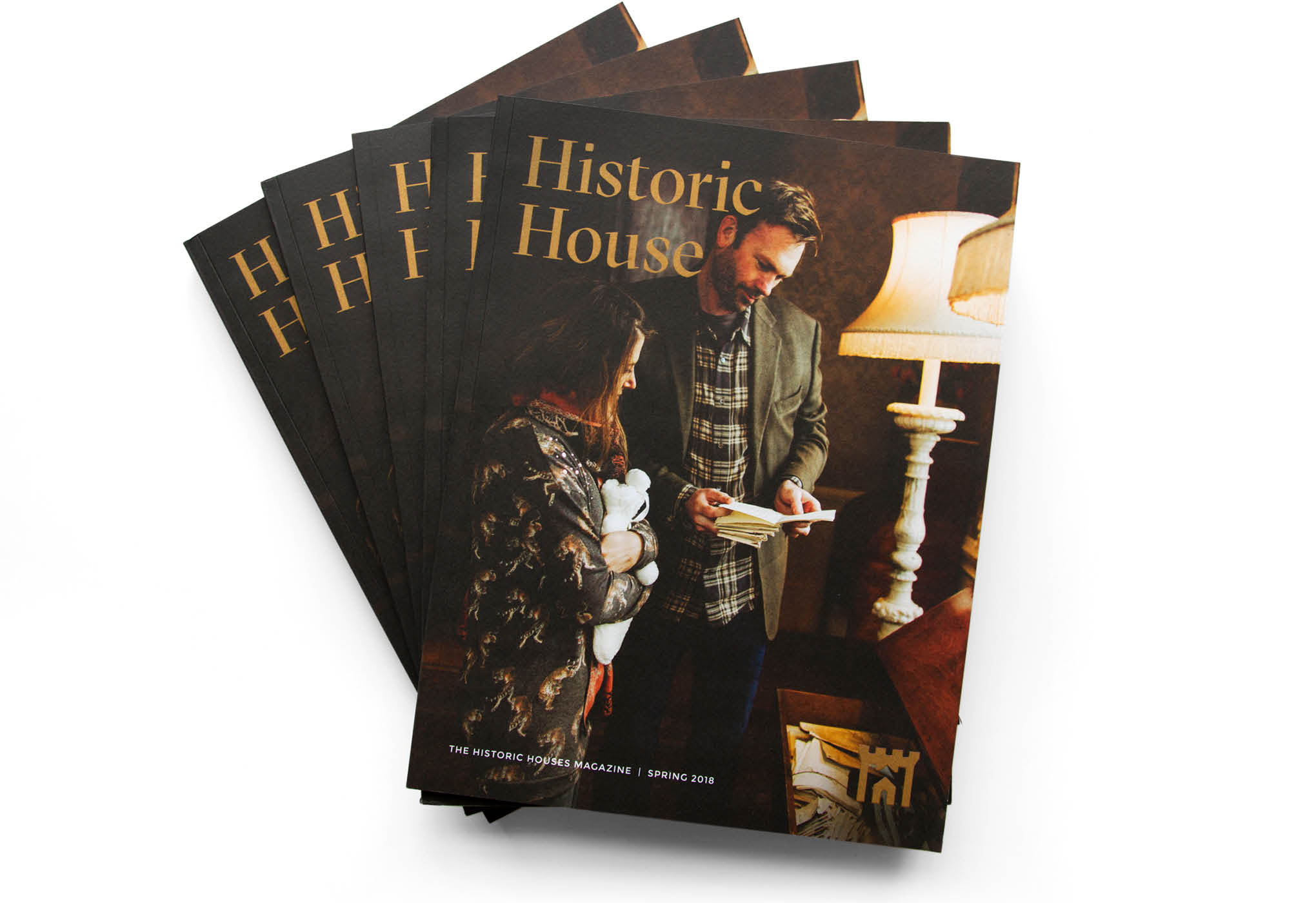
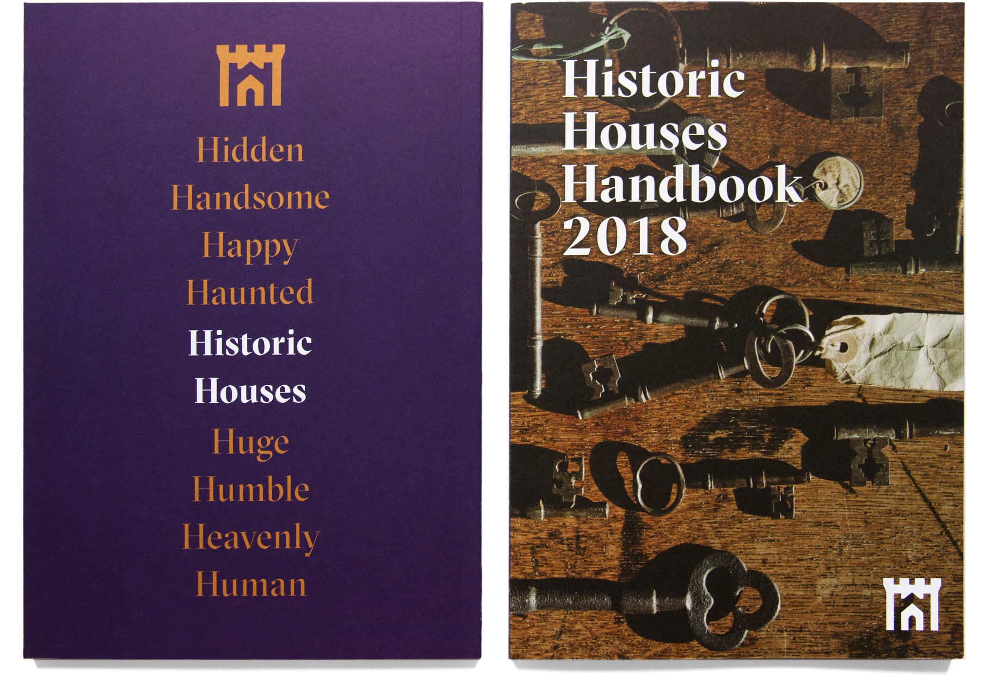
A rebrand for Britain’s largest collection of independently owned historic homes and gardens. Their original logo had survived untouched for decades – the task was to update the brand while retaining the distinctiveness of the organisation.
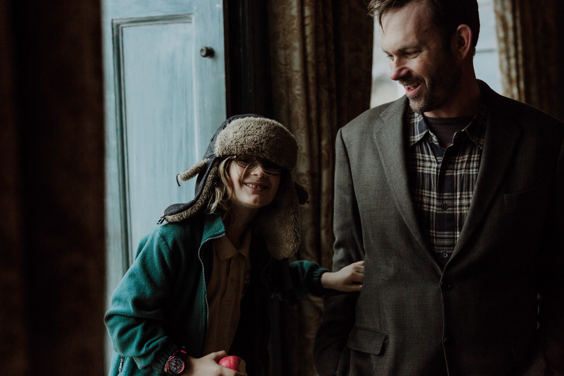
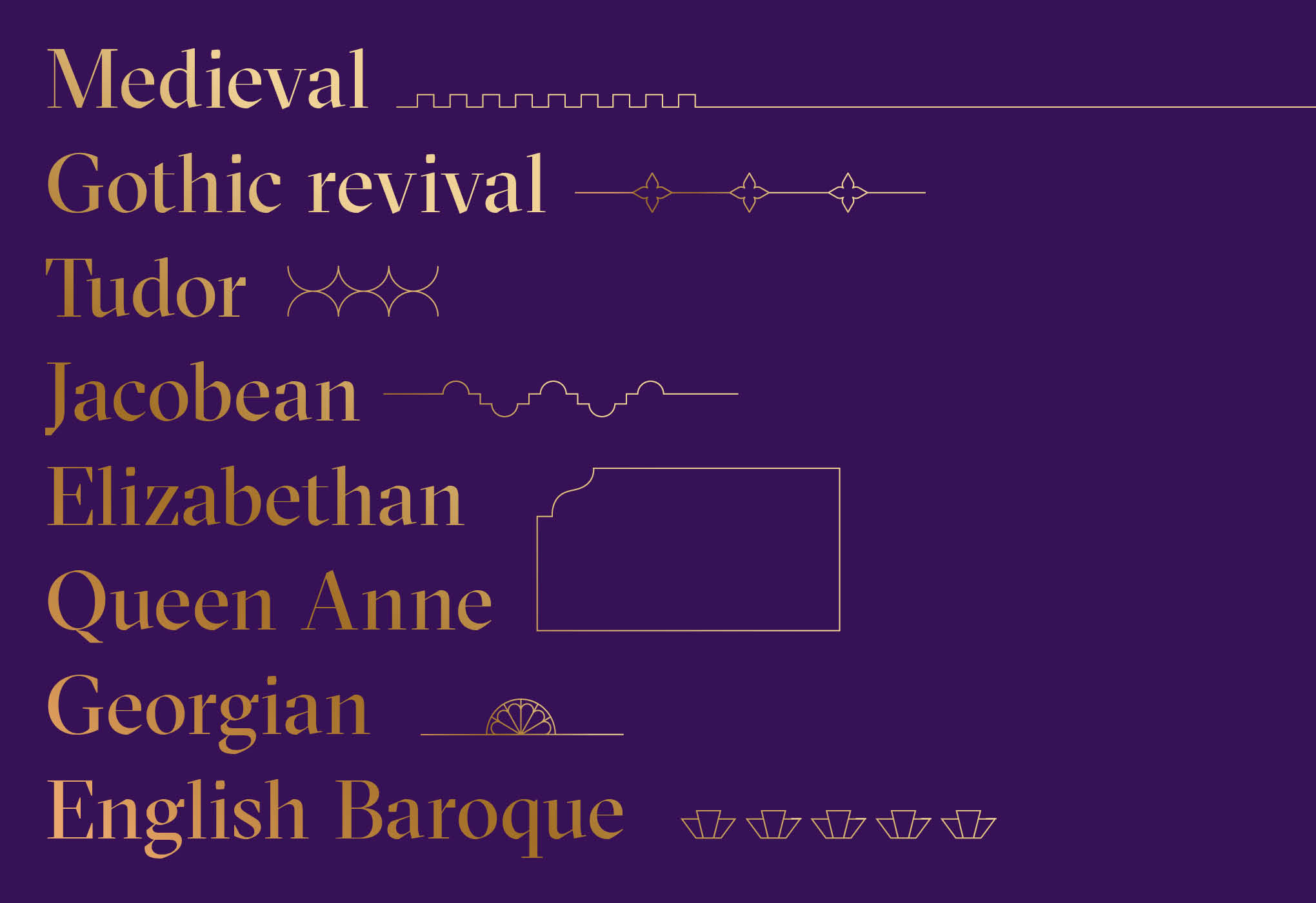
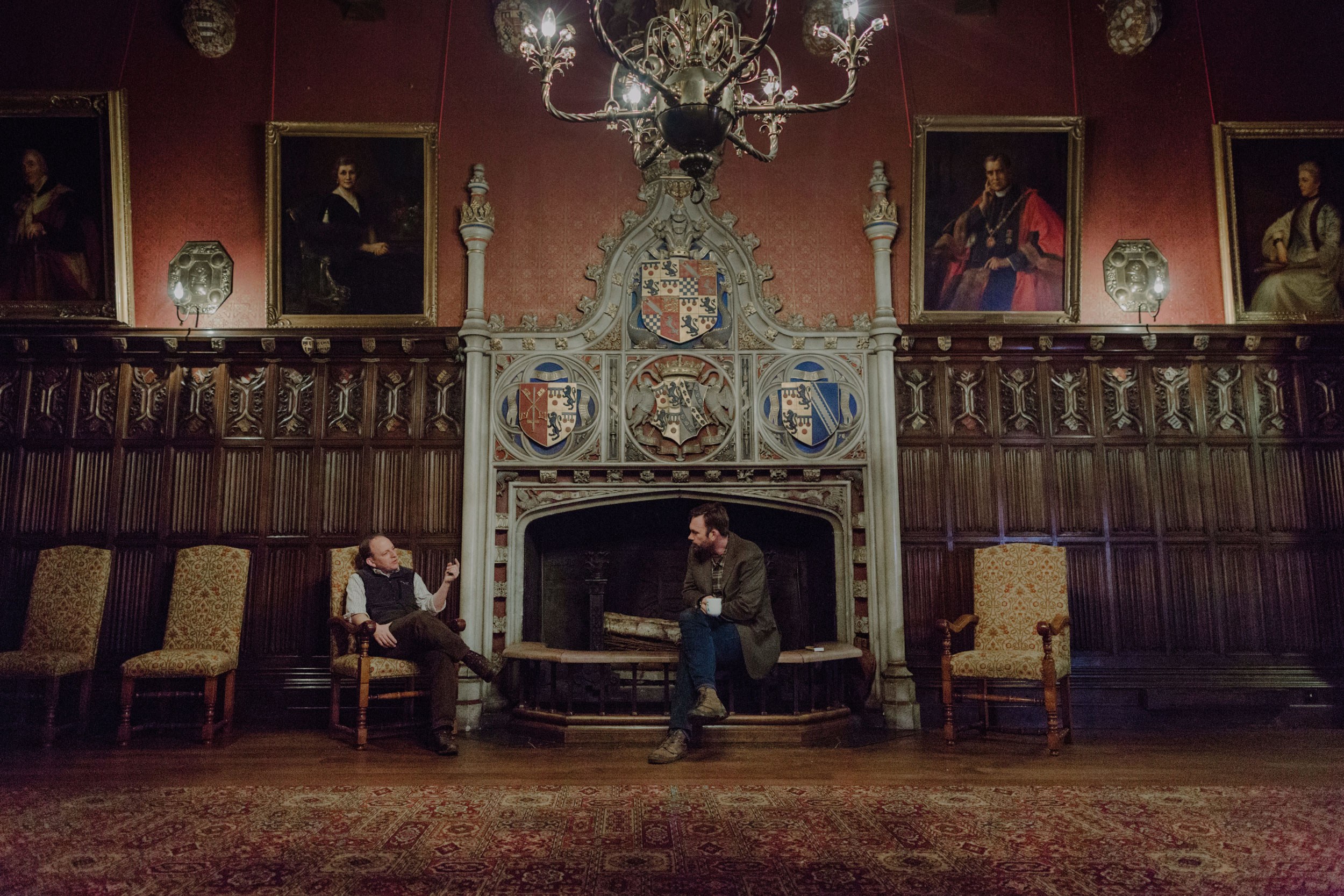
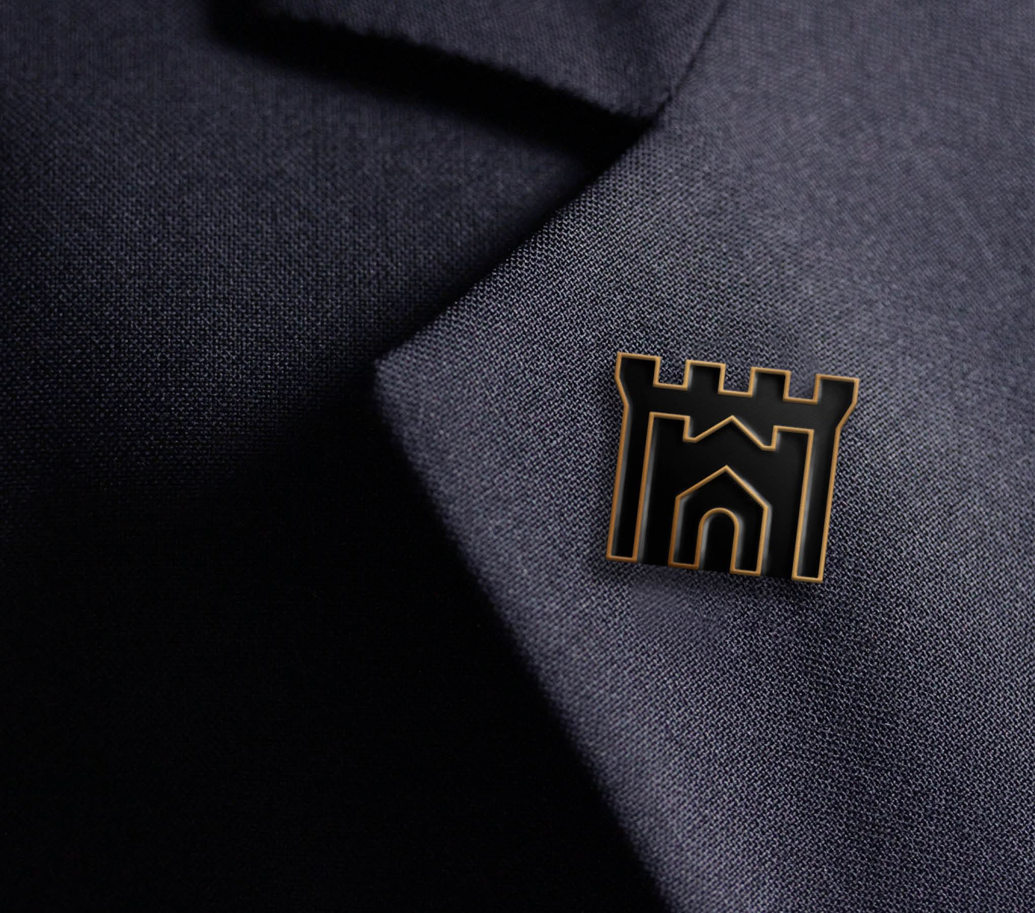
The solution came from two different angles – firstly to hint at the sheer quantity of houses within the association (over 1600) by redesigning their symbol to hint at that scale, from cottages, to houses to castles. Then the scheme itself concentrates on the key difference that these houses offer – they are lived-in, alive and each with its own story to tell.


Featured in
Logo, revised edition
Author: Michael Evamy
Published: 2021
Awards
2018 Brand Impact Awards | Culture | Shortlisted
Credits
Studio
Johnson Banks
Role
Lead Designer
Art Direction
Creative Direction
Michael Johnson
Design Team
Julia Woolhams
Katherine West
Copywriters
Michael Johnson
Nick Ashbury
Photography
The Curries
Selected Works
Start Small Think BigCorporate design
Mutha VeganBranding, Campaign

DuolingoBranding
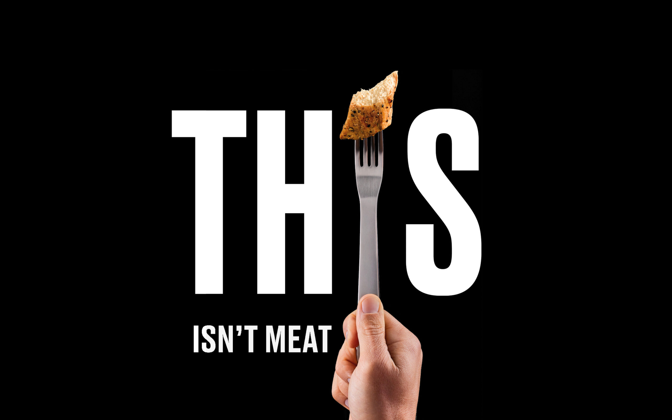
THISBranding, Campaign

Teach FirstBranding

Manchester CollectiveCampaign

Twelve TownBranding

Great Ormond Street HospitalCorporate Design

RecollectBranding
Sydney FestivalBranding