Client
Sydney Festival
Studio
Alphabet Studio
Disciplines
Brand identity
Campaign & advertising
Art direction
Digital and moving image
Print design
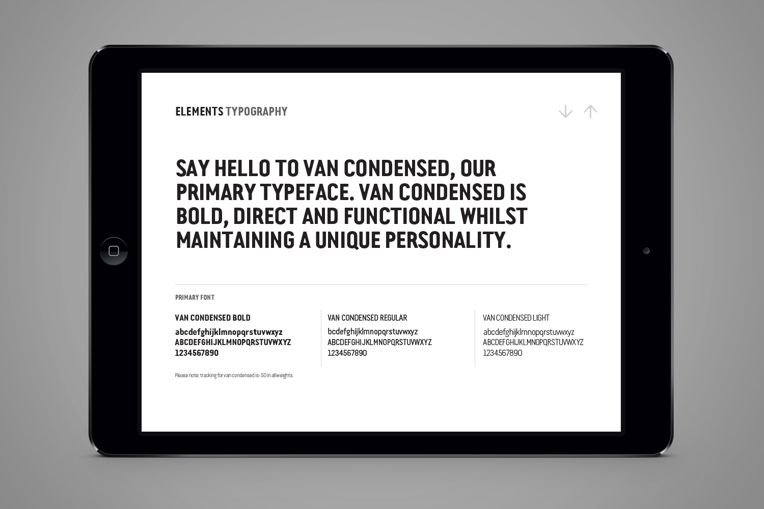
Typography
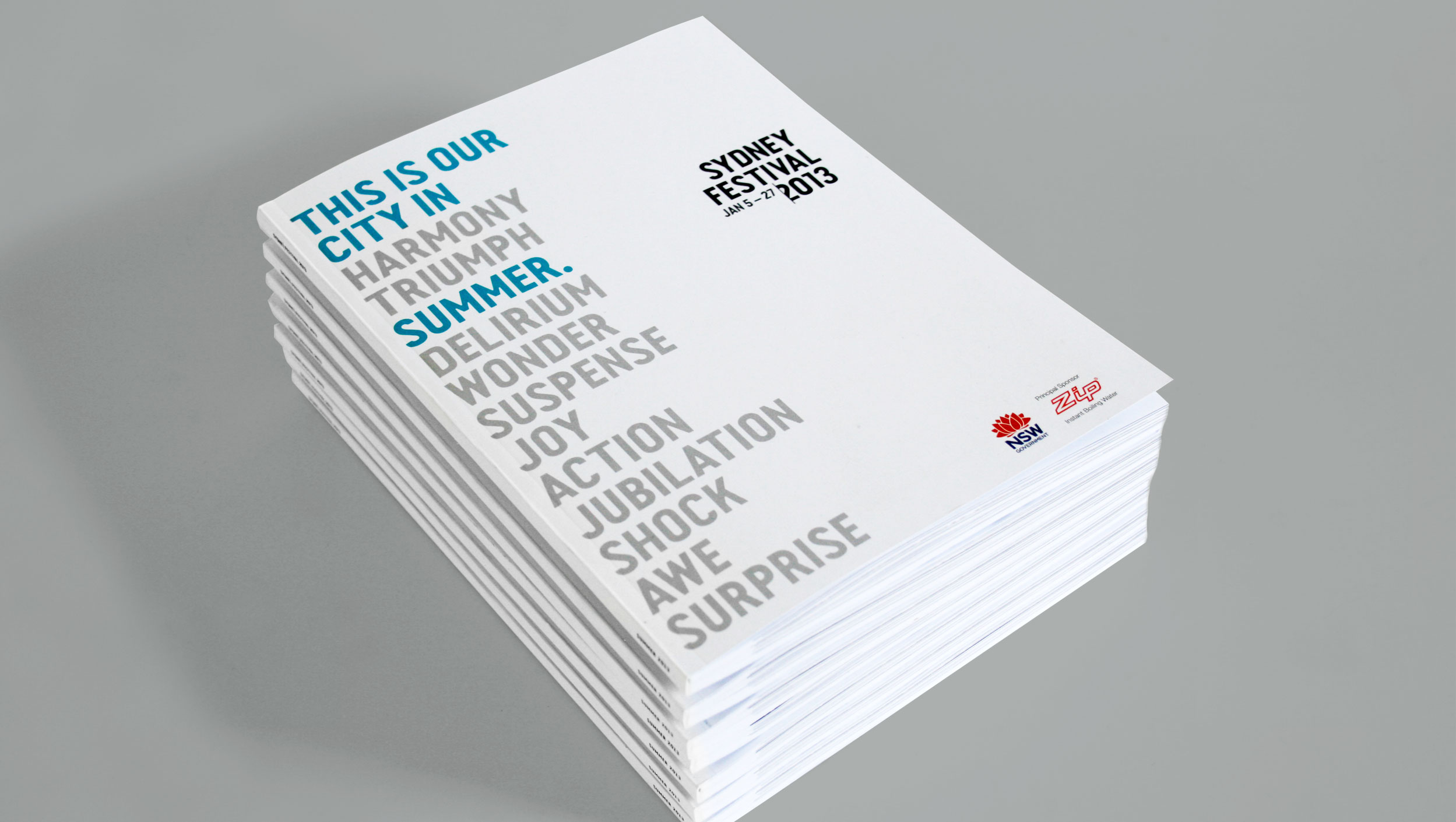
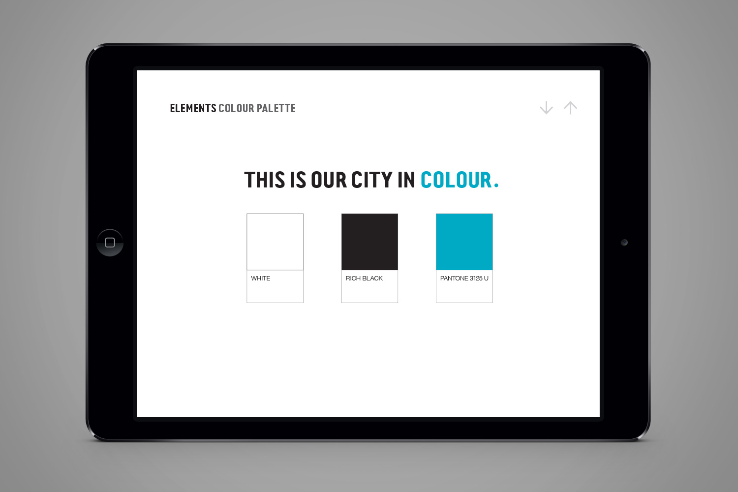
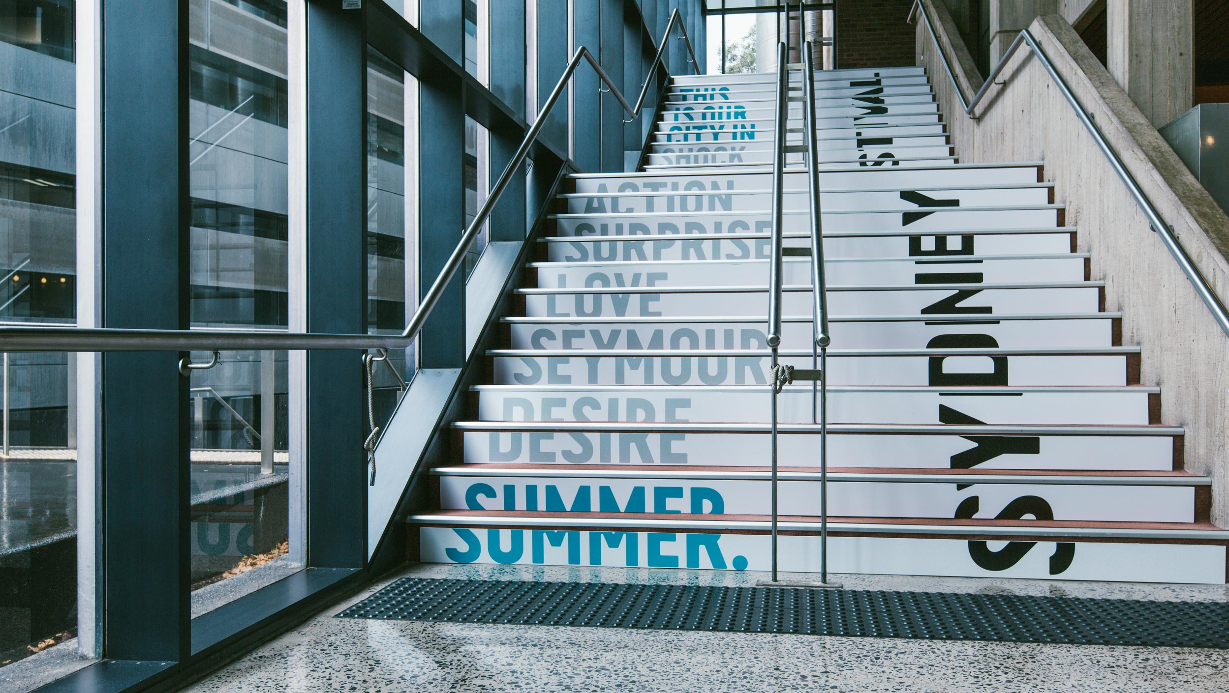
This is our city in summer
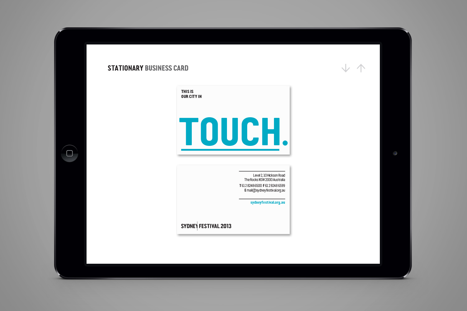
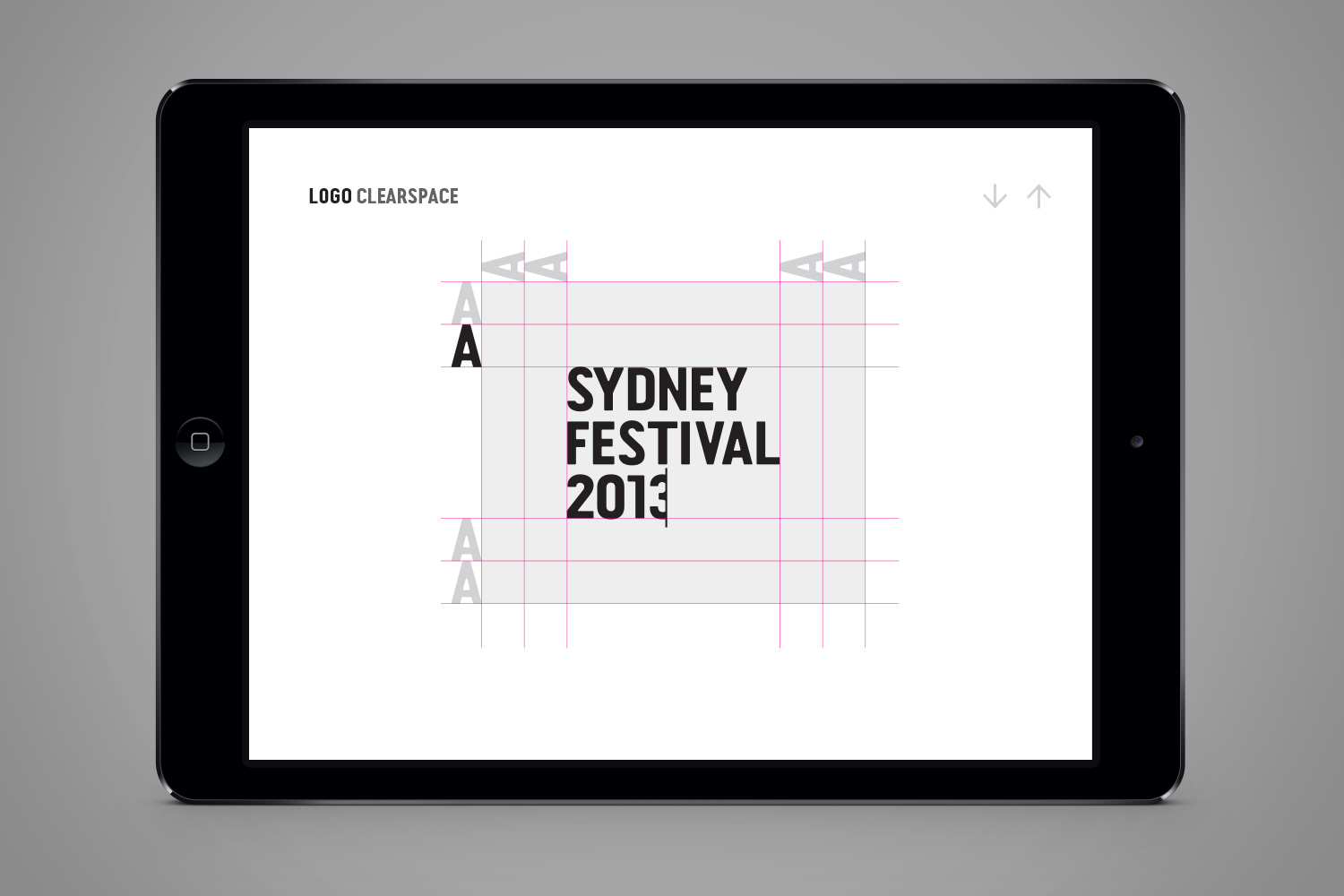
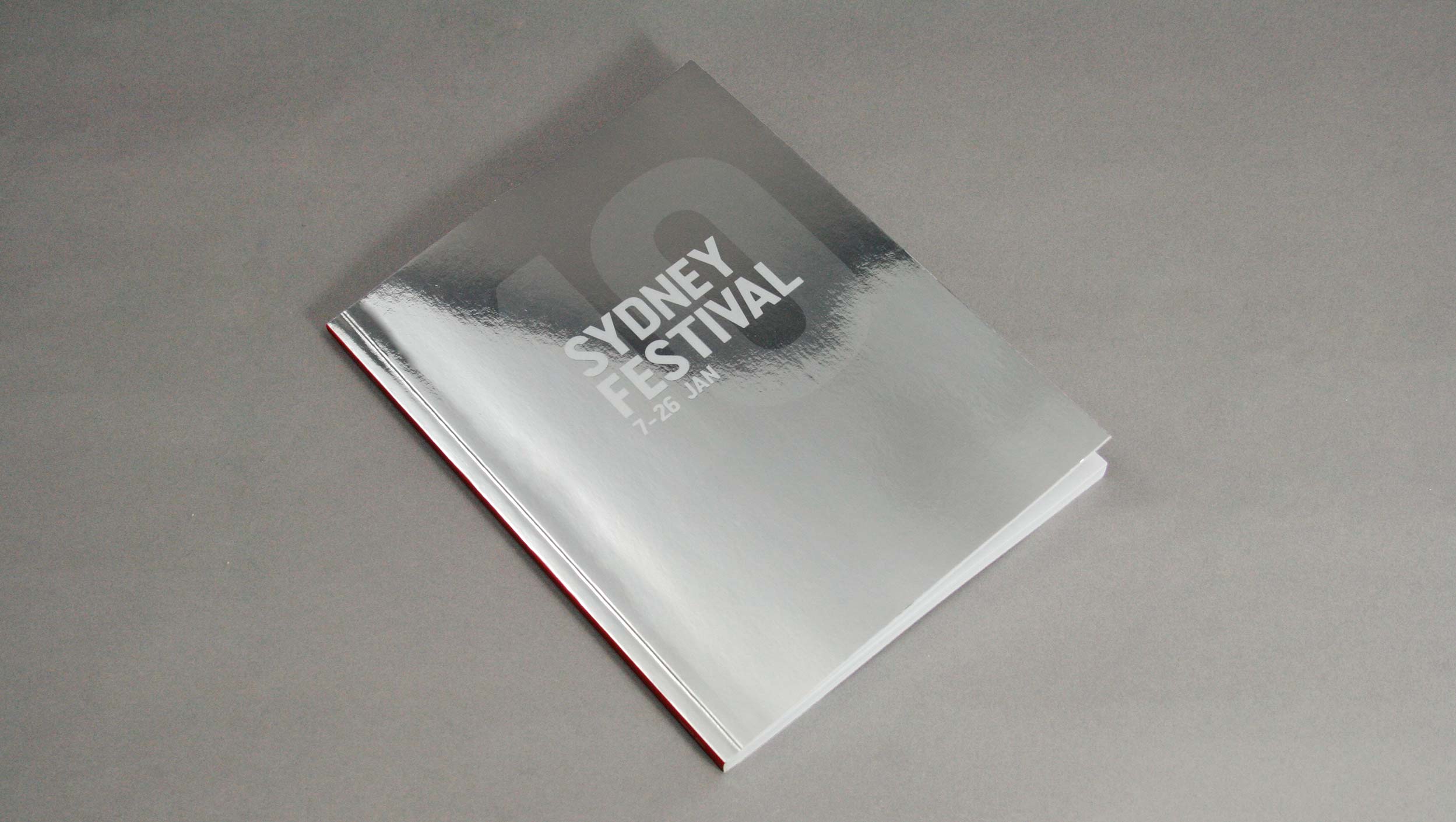
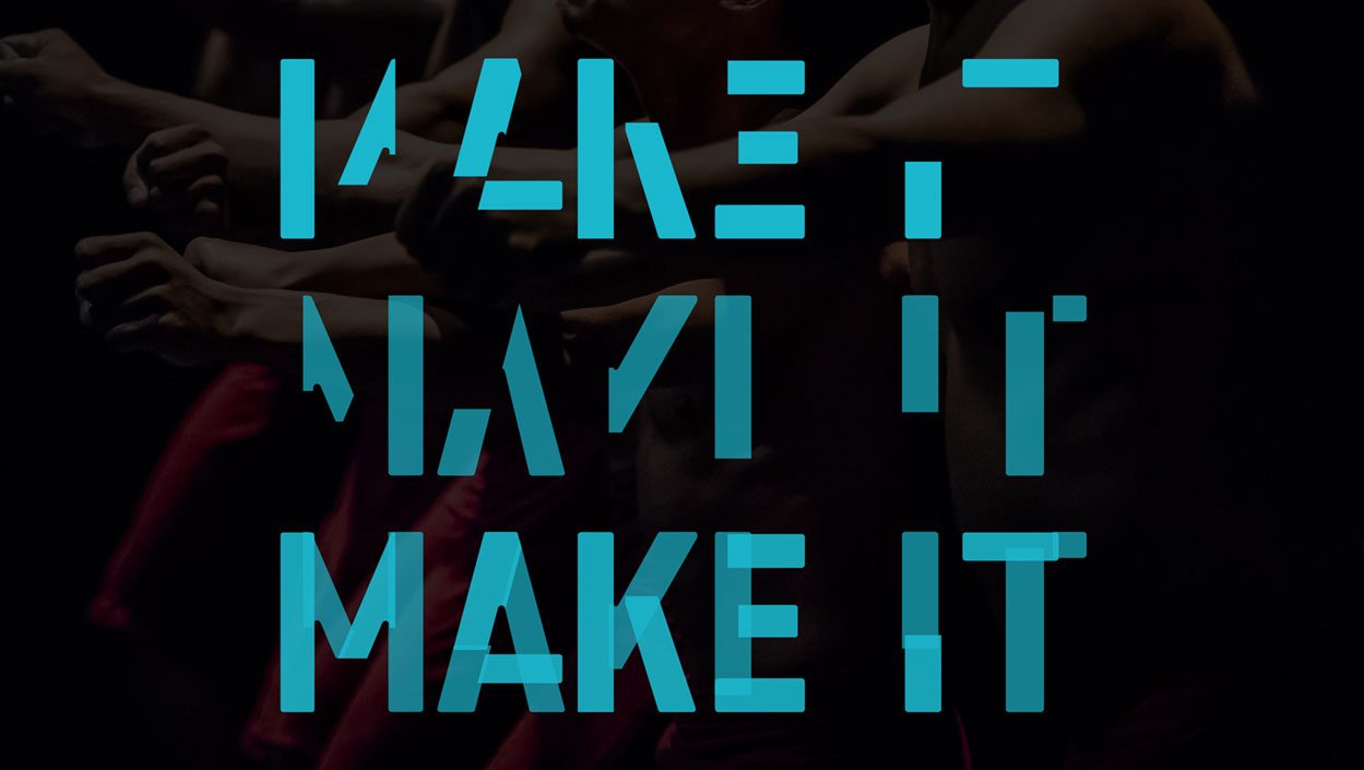
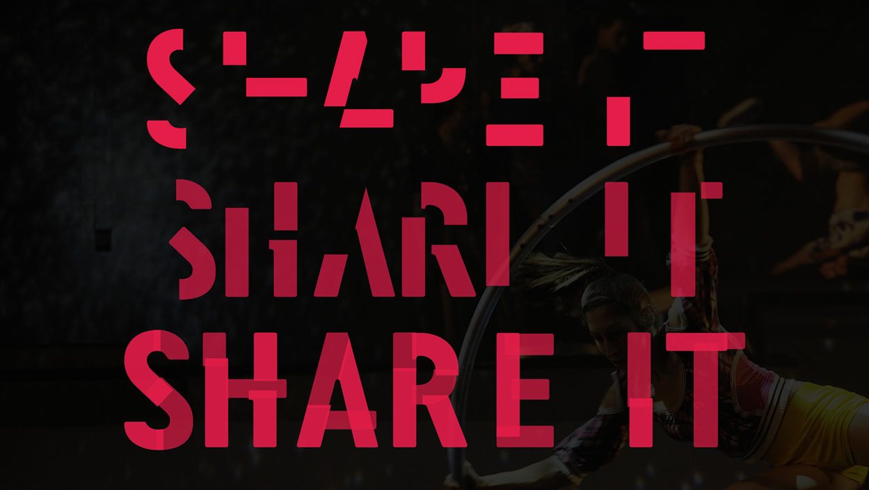
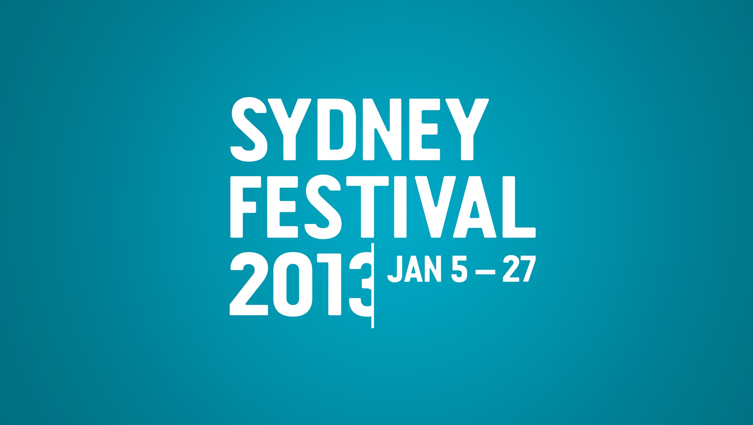
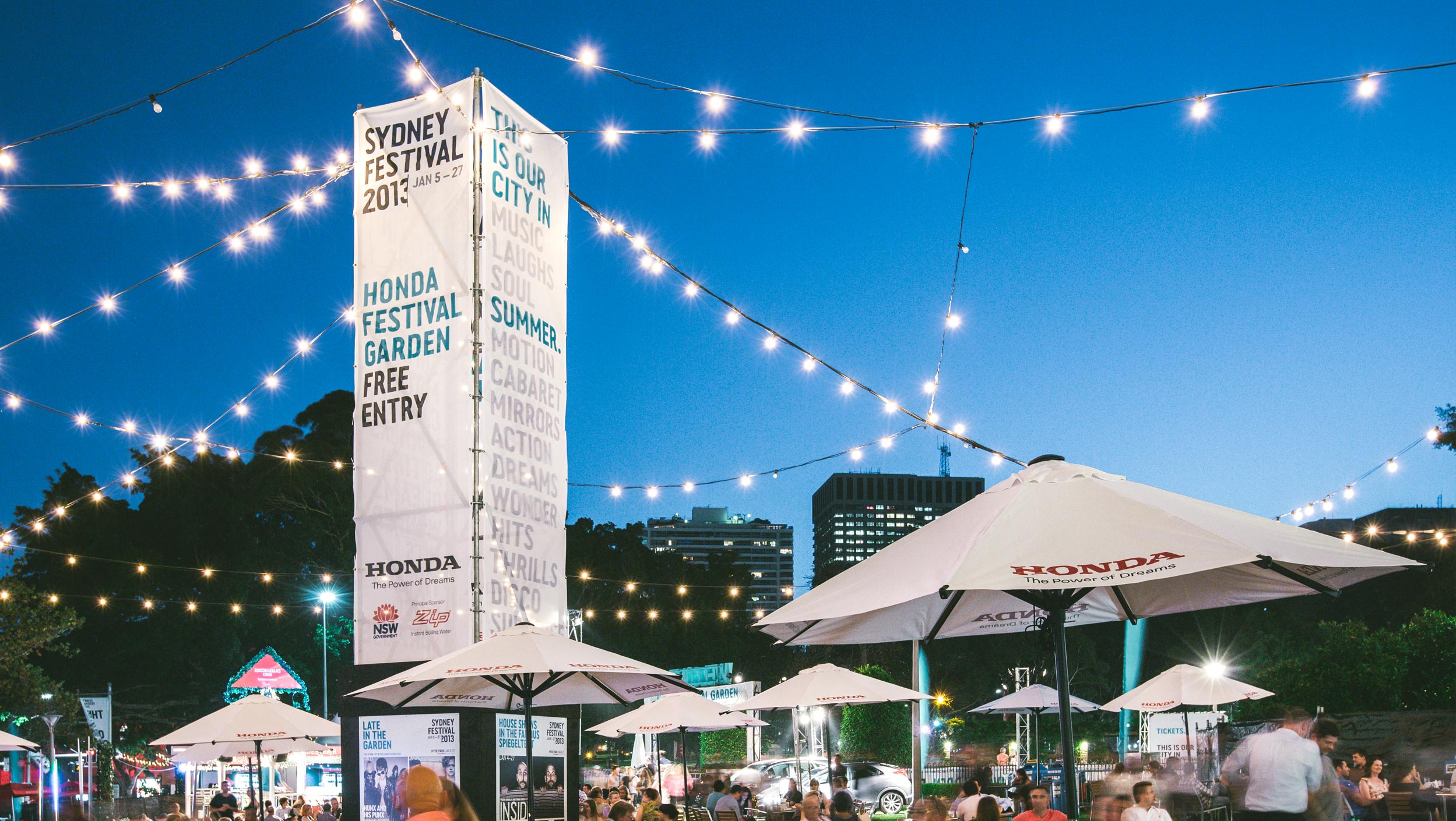
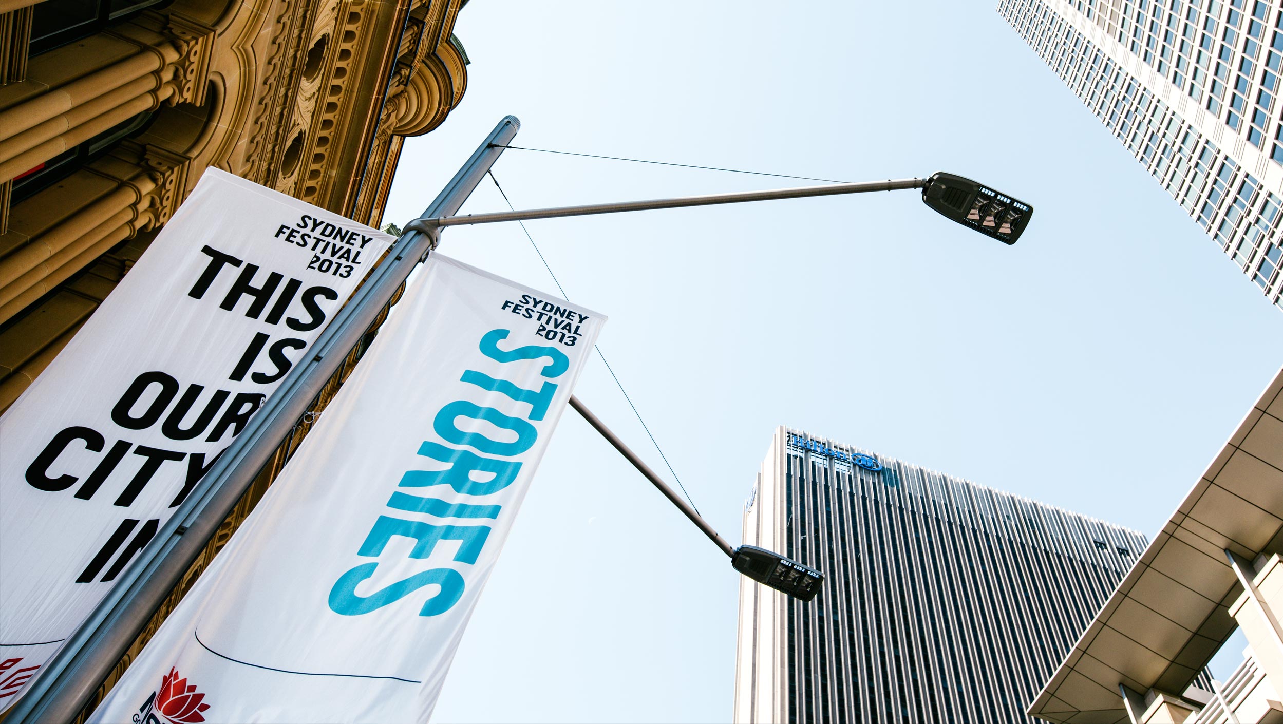
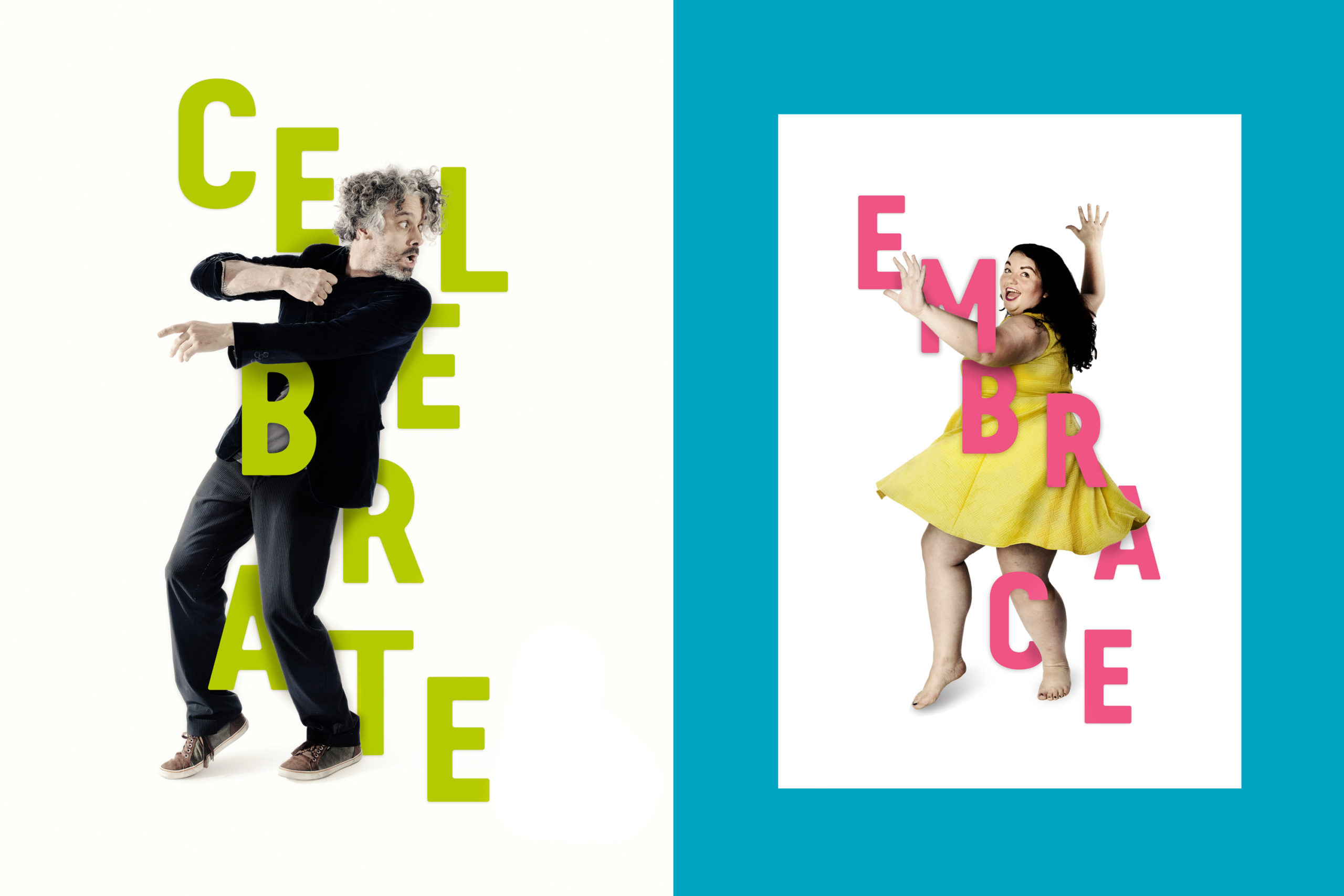
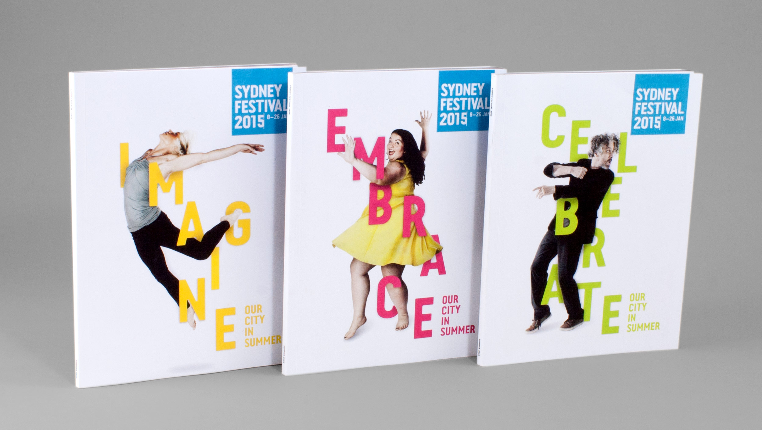
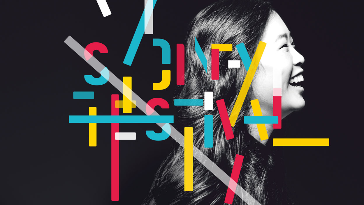
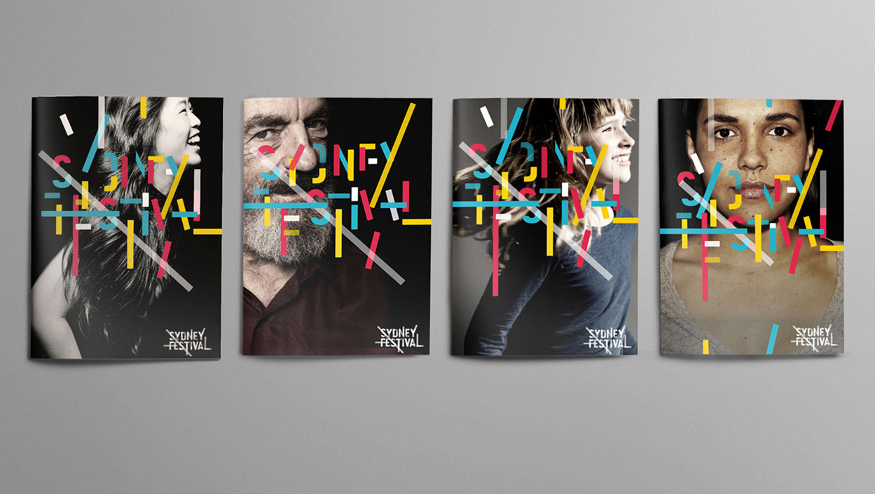
In 2013, we were invited to create a new identity for the Sydney Festival, the preliminary arts and cultural event which takes place in the first three months of January each year. The brief was to build a brand that would survive beyond the three year term of the Artistic Director.
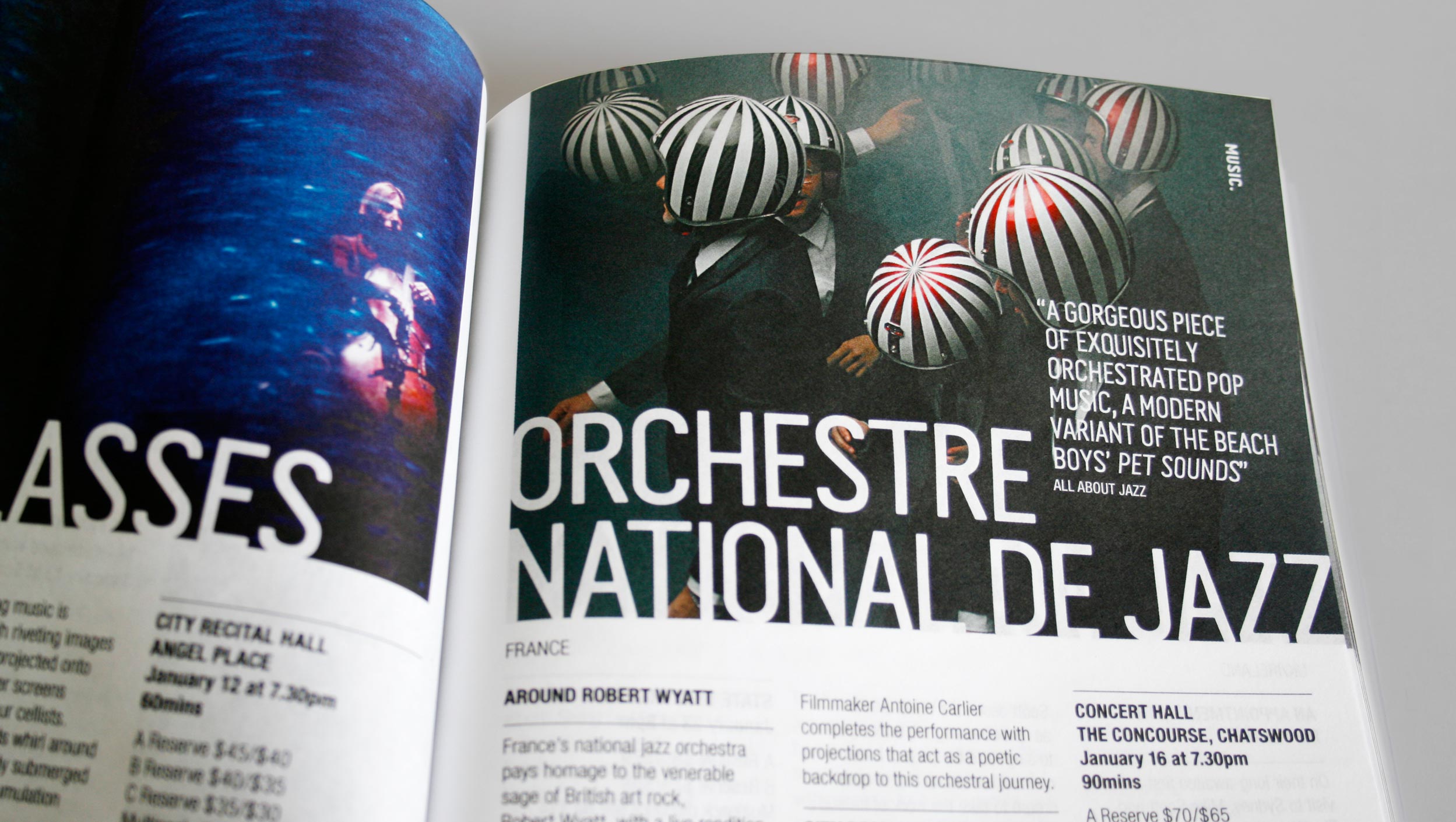
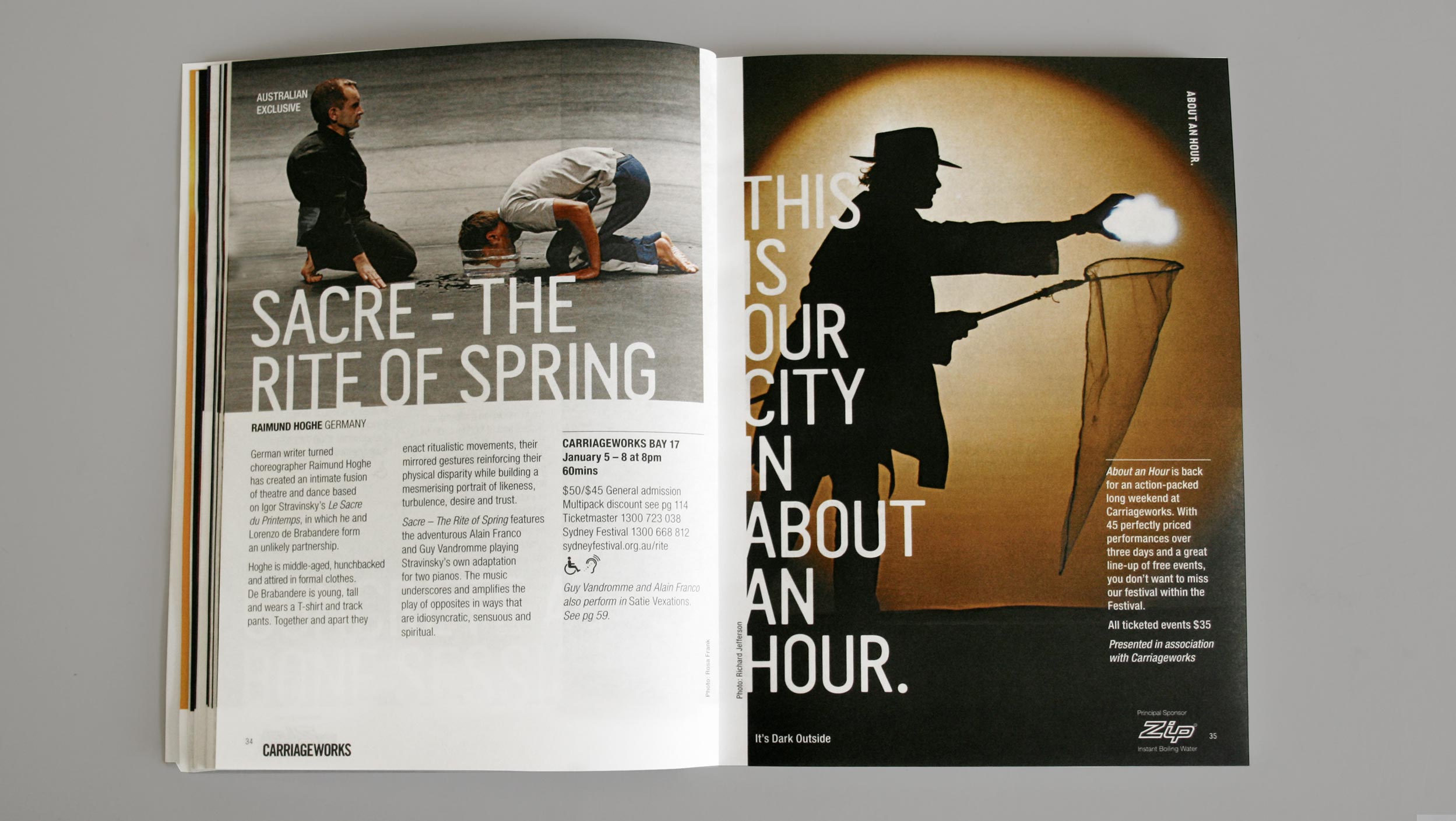
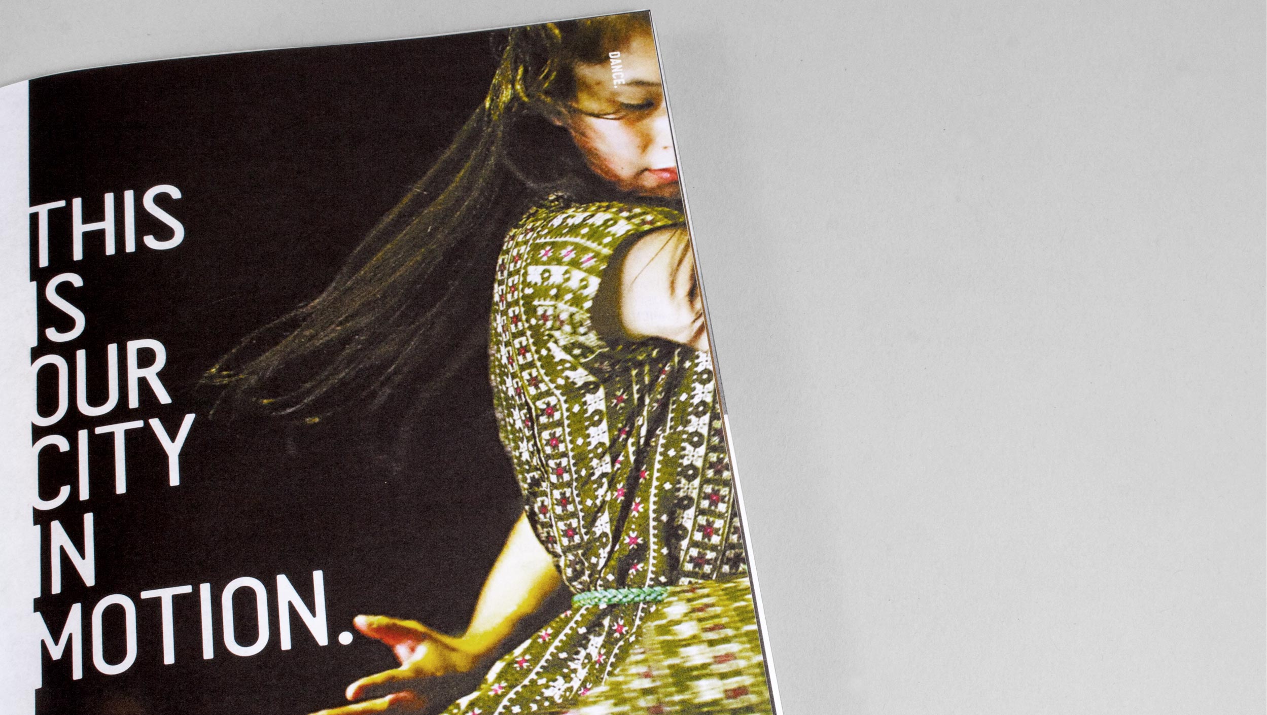
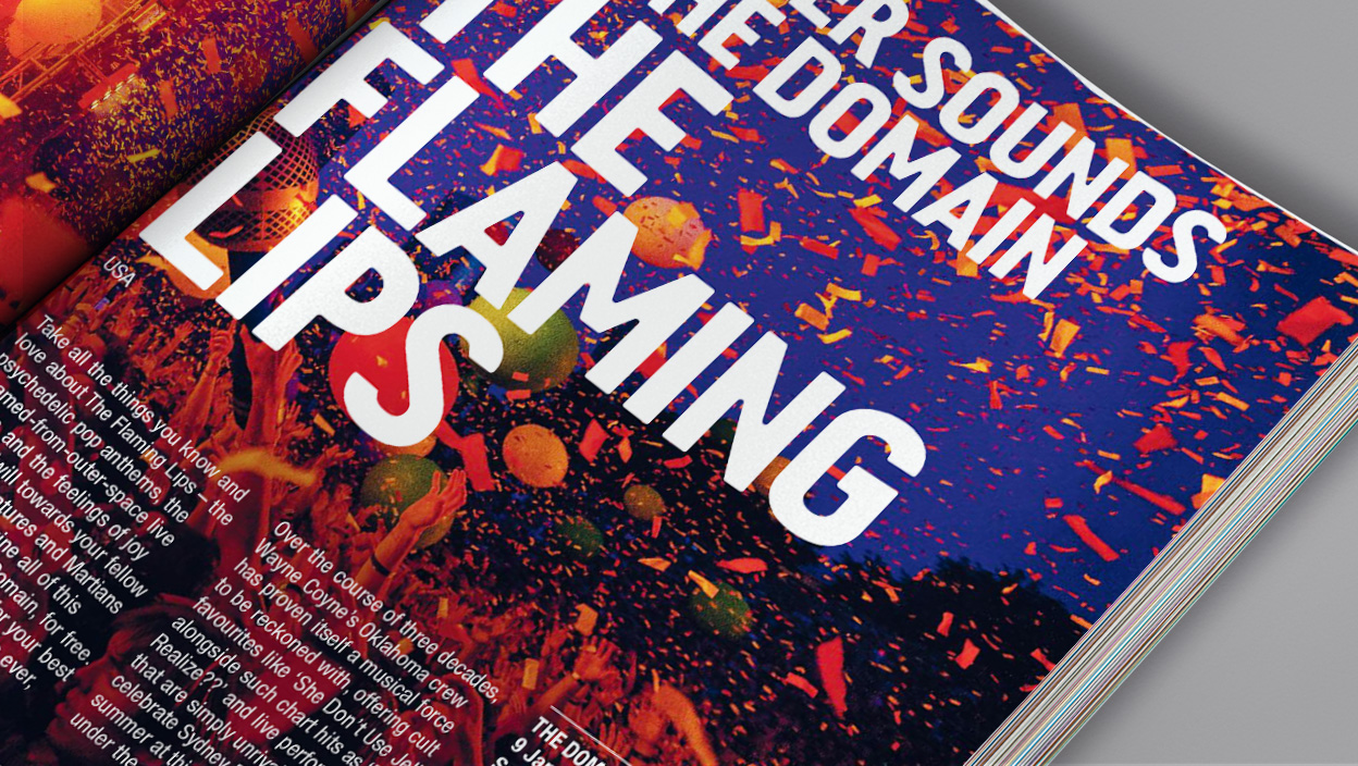
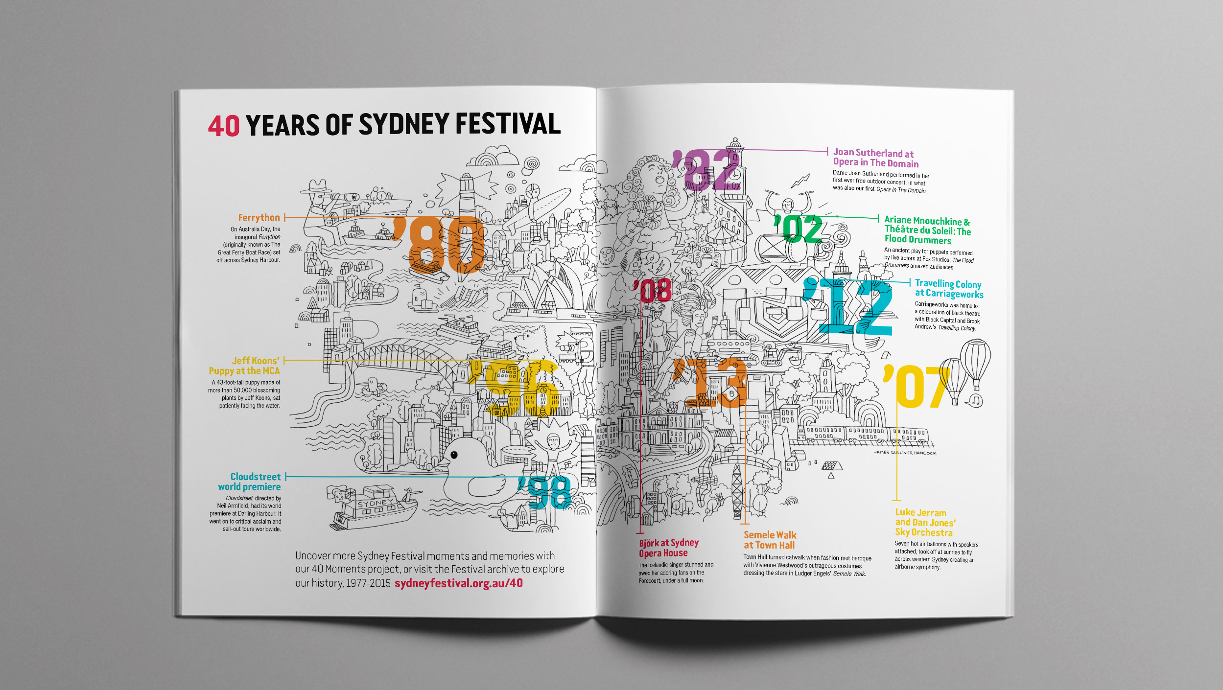
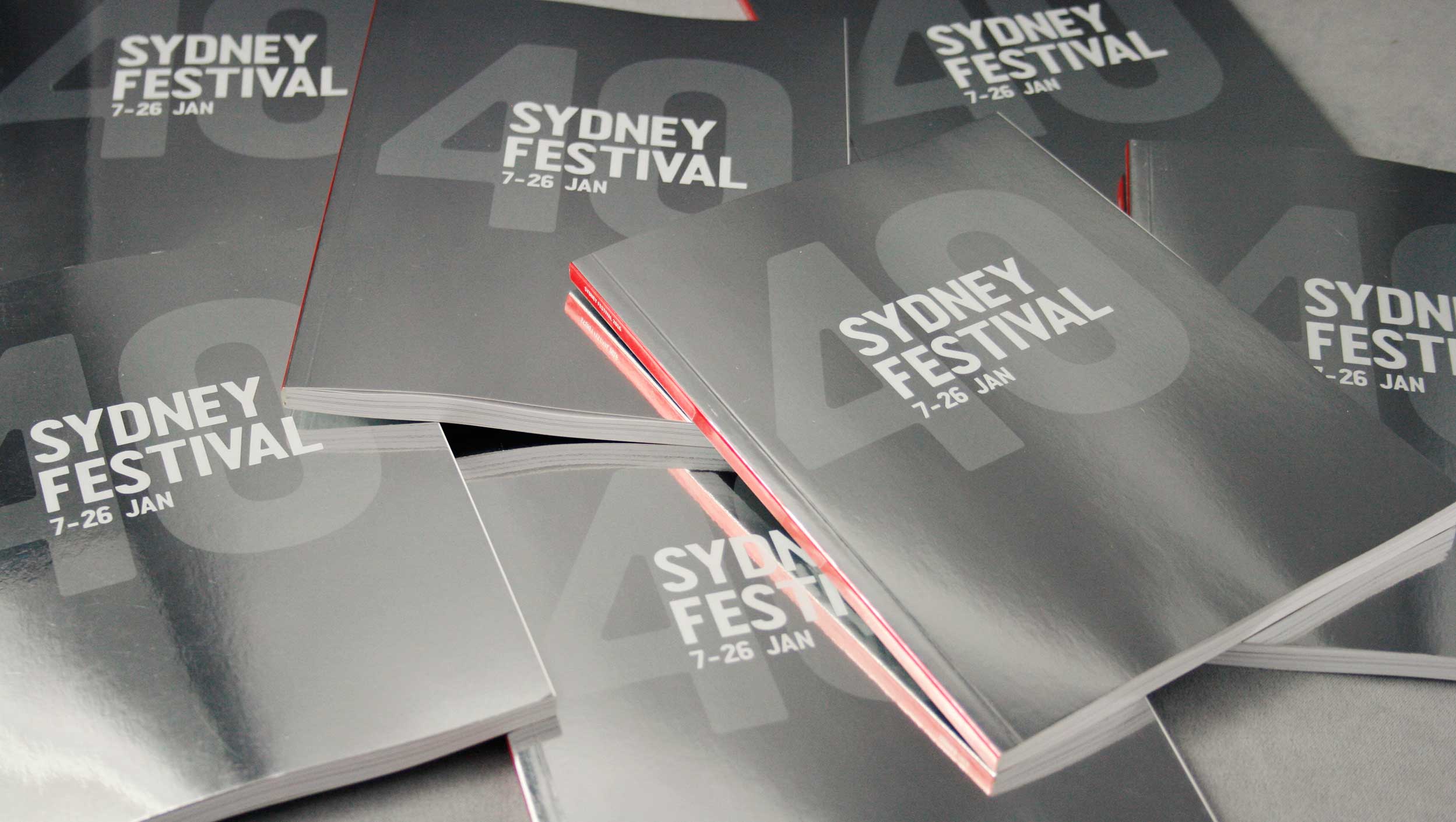
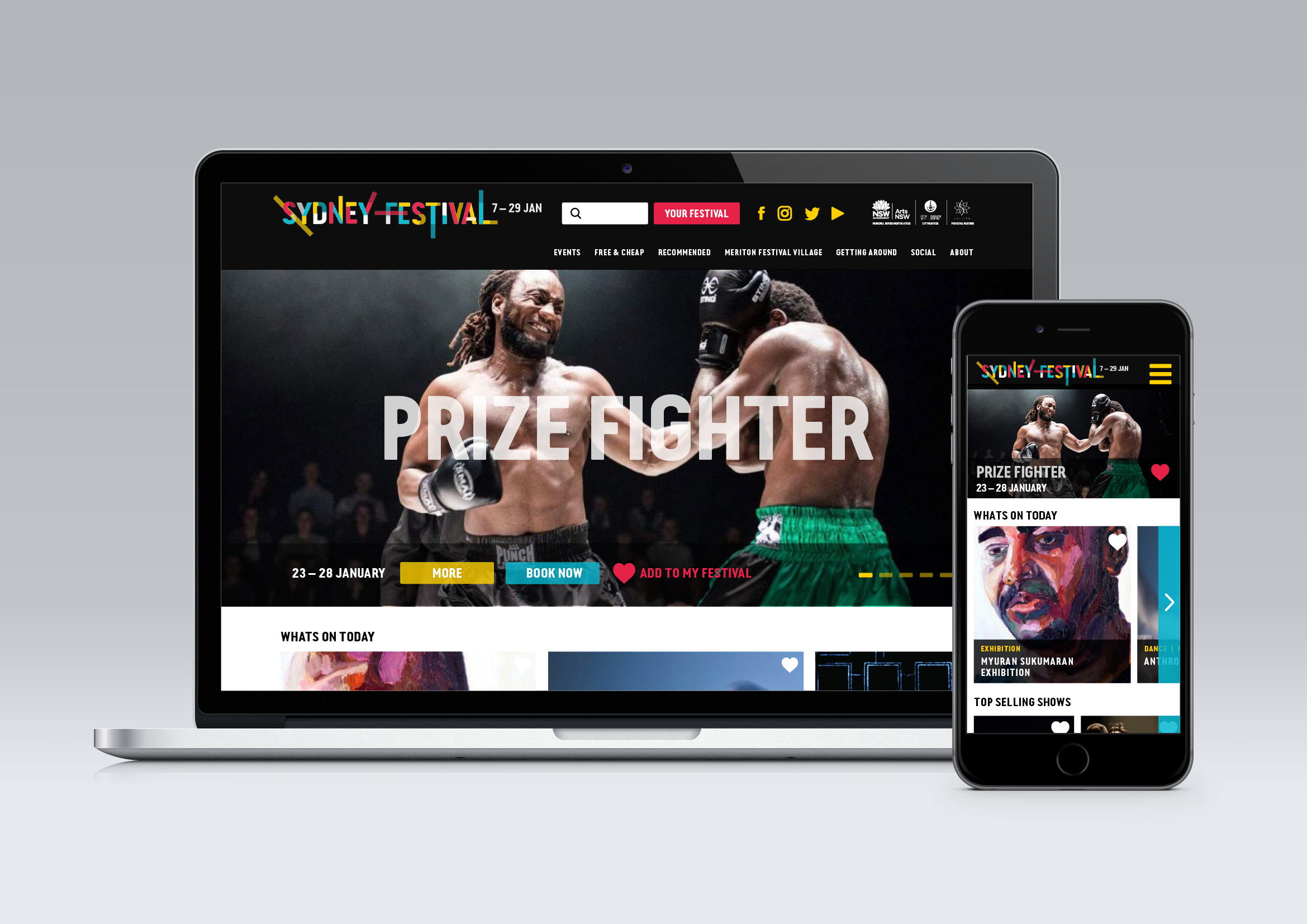
A word based identity solution was developed using the existing brand asset ‘This is our city in summer’ in a re-energised, focused and liberated way. Over the past five years, the identity has evolved to be a recognisable brand indicative of the energy and vibrancy of the festival.
2017 Brand evolution
Studio
Alphabet Studio
Role
Senior designer
Creative Direction
Paul Clark & Tim Kliendienst
Selected Works

Start Small Think BigCorporate design
Mutha VeganBranding, Campaign

DuolingoBranding
THISBranding, Campaign

Teach FirstBranding

Manchester CollectiveCampaign

Twelve TownBranding
Historic HousesBranding
Great Ormond Street HospitalCorporate Design

RecollectBranding
