Info
2013–2017
Made at alphabet studio
Made at alphabet studio
client: sydney festival
Role: senior designer
Creative Team
tim kliendeinst
paul clark
lara juriansz
ashley steel
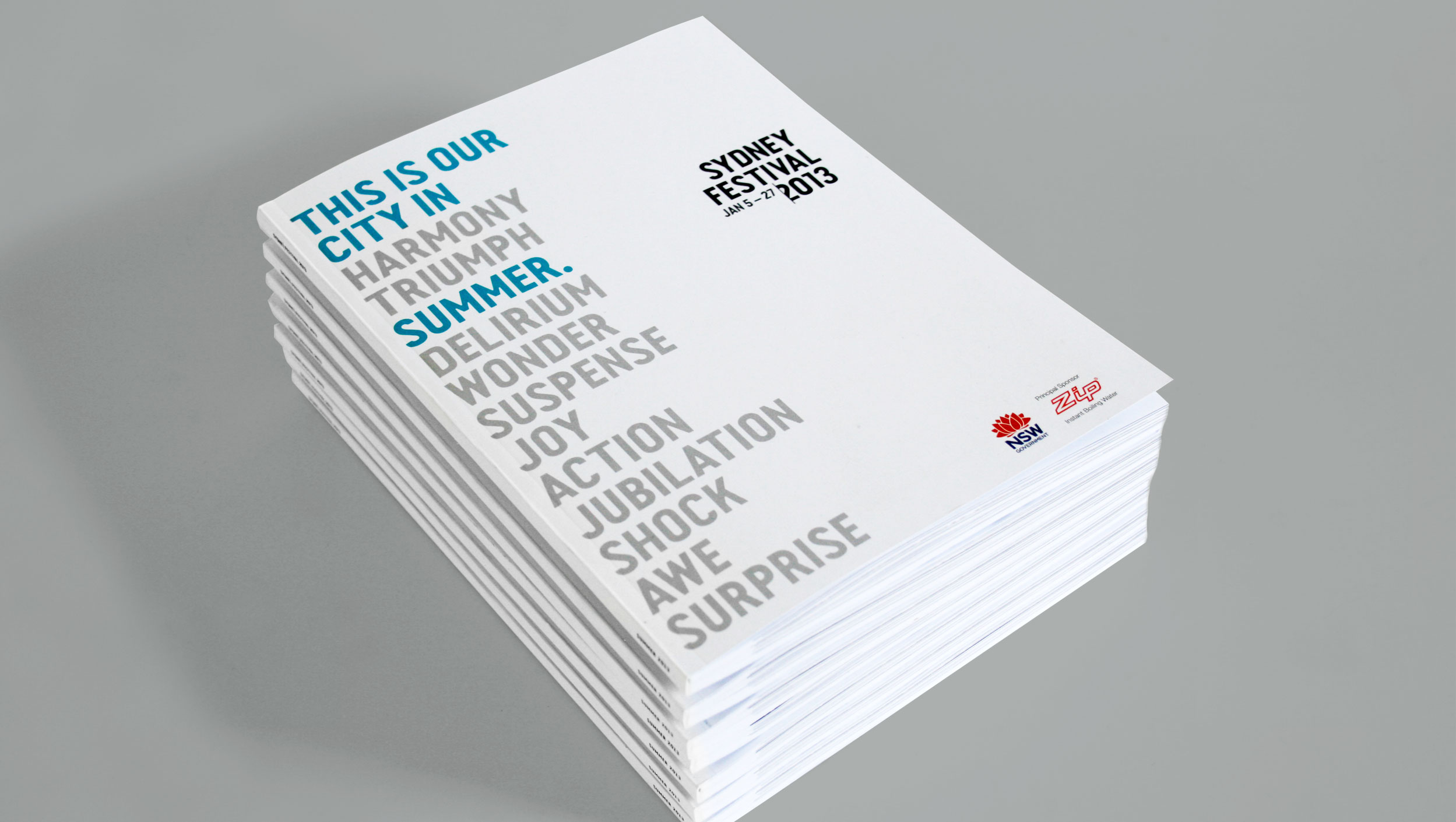
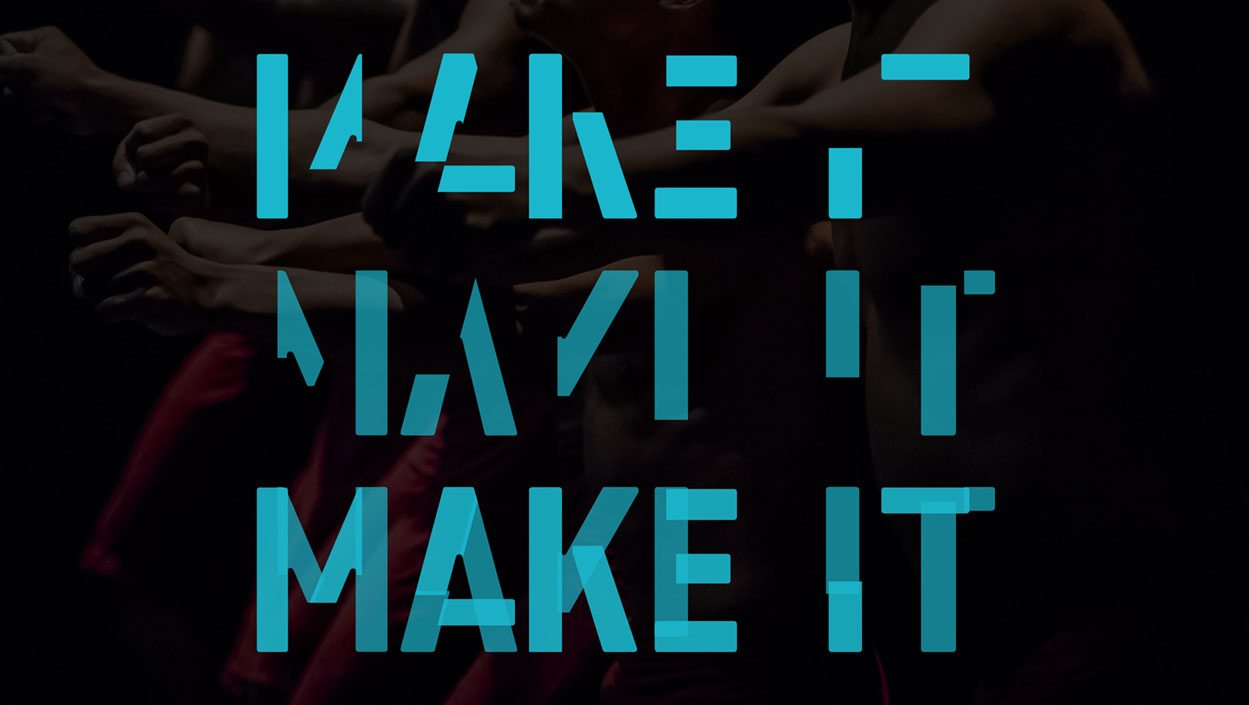
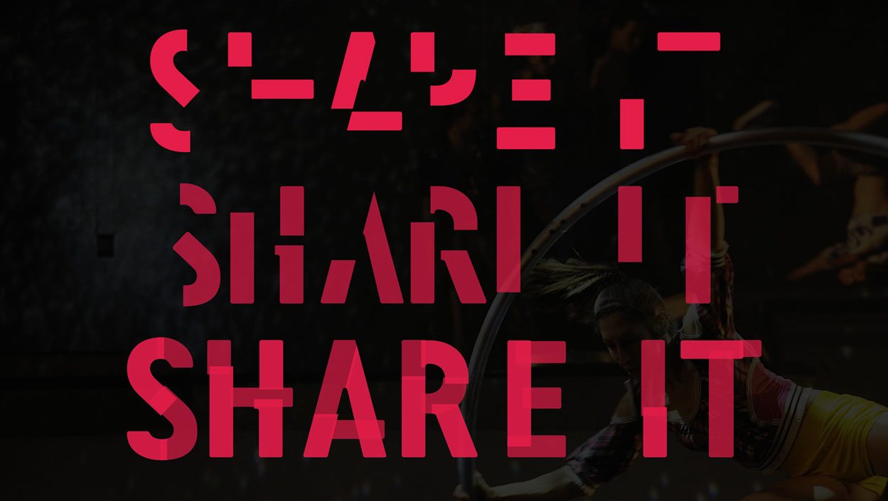
In 2013, Alphabet Studio were invited to create a new identity for the Sydney Festival, the preliminary arts and cultural event which takes place in the first three months of January each year. The brief was to build a brand that would survive beyond the three year term of the Artistic Director.
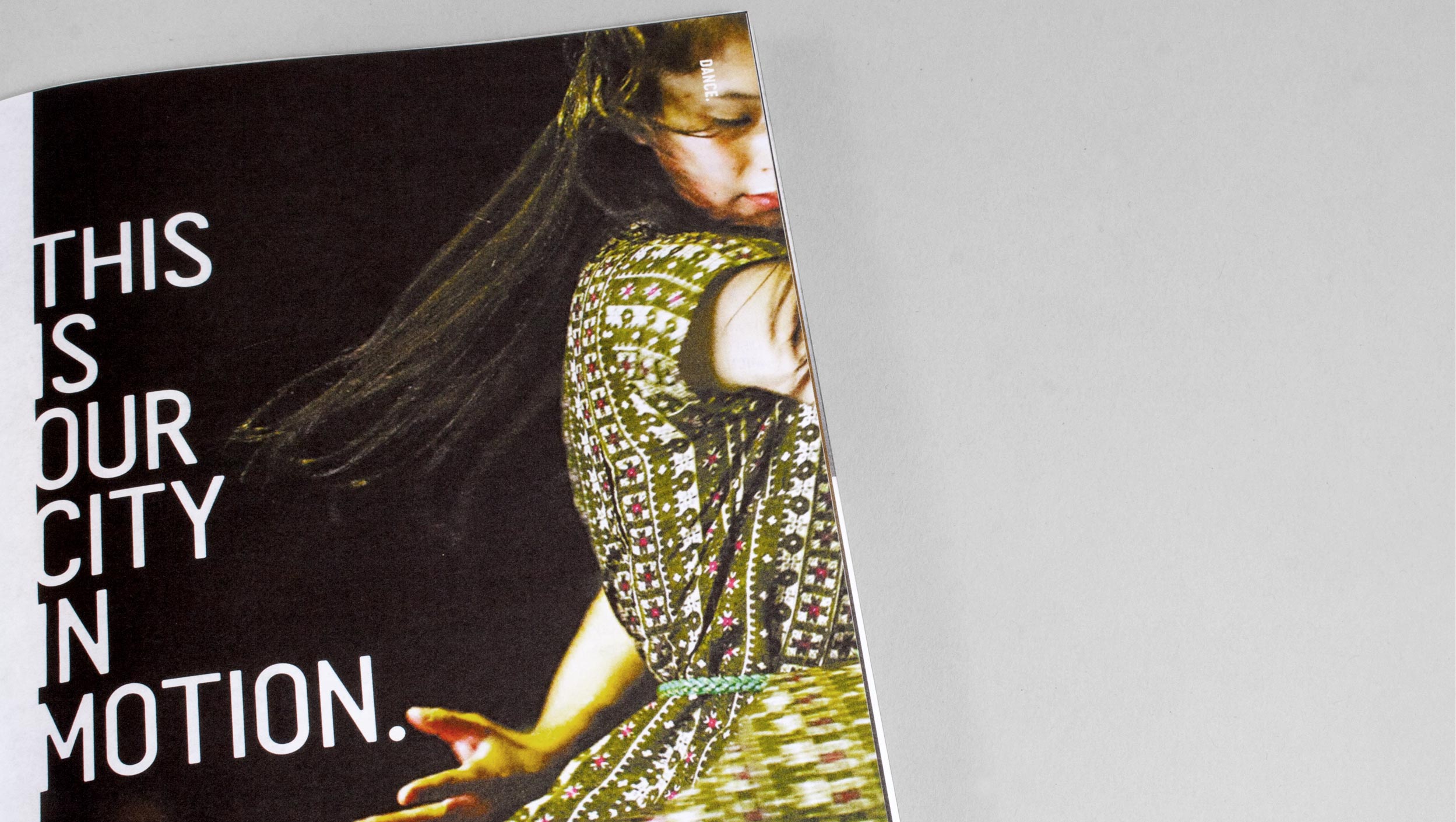
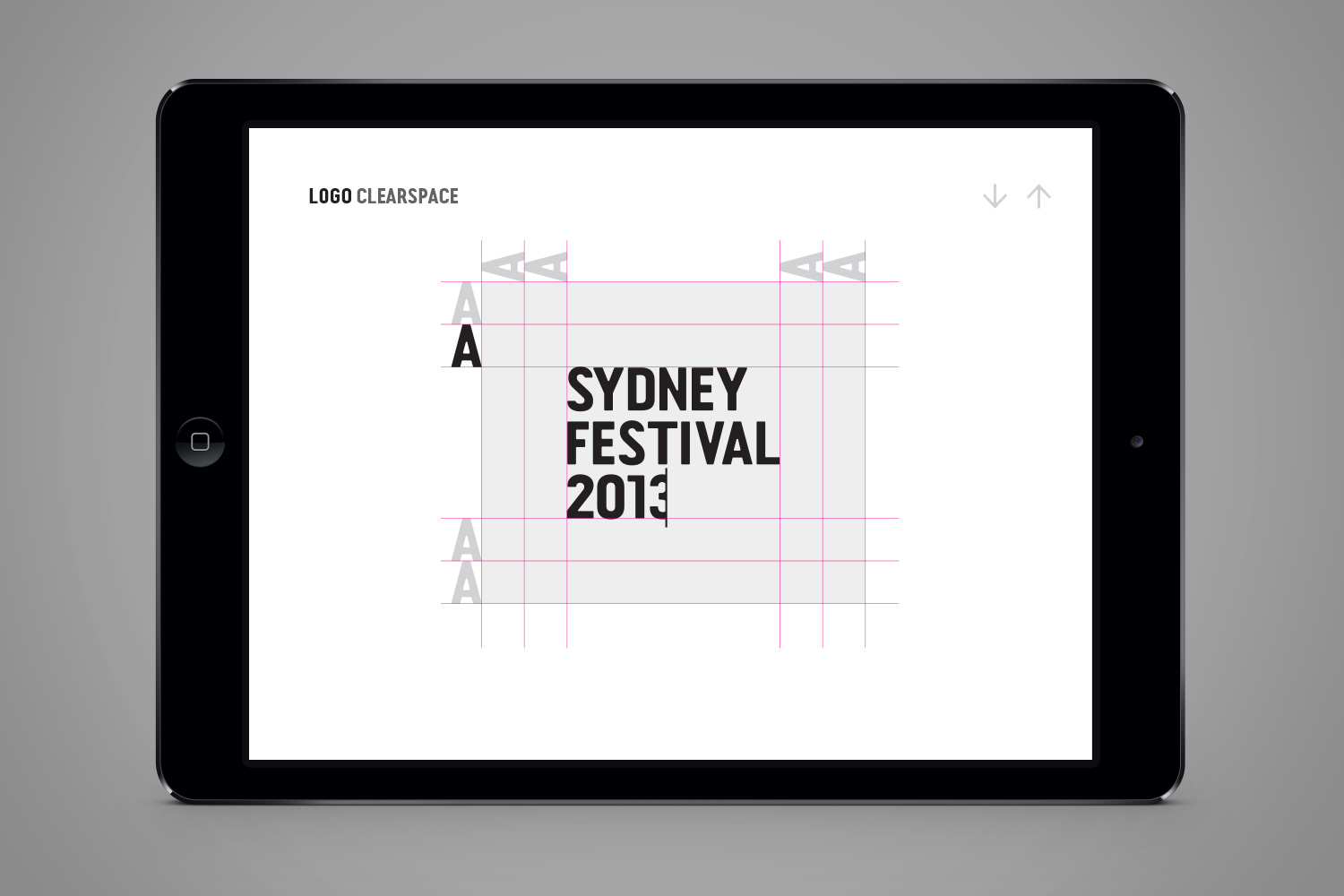
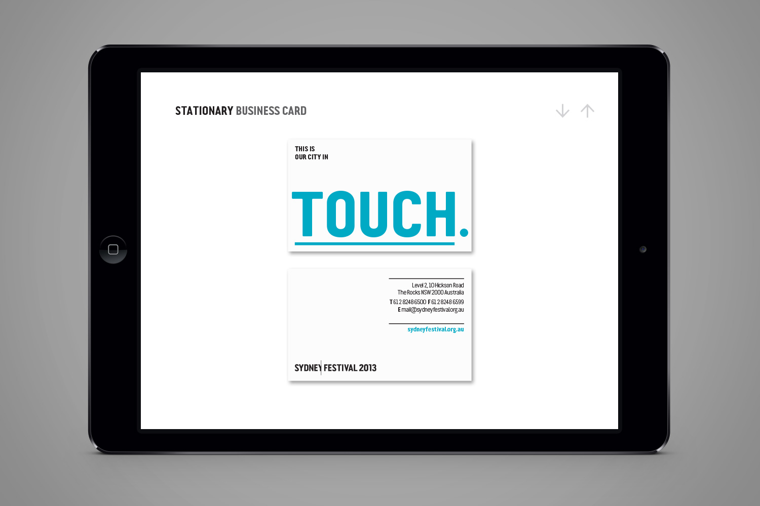
A word based identity solution was developed using the existing brand asset ‘This is our city in summer’ in a re-energised, focused and liberated way. The visual identity was upheld for 9 years over two very different artistic directors tenureship. It continued to evolve over these years as a hallmark indicative of the energy and vibrancy of the festival.


")

2017 Brand evolution


Selected Works

Apple TV RebrandBranding

SwitchersCampaign

Apple 100 Best AlbumsCampaign
Start Small Think BigBranding

UndauntedBranding

DuolingoBranding
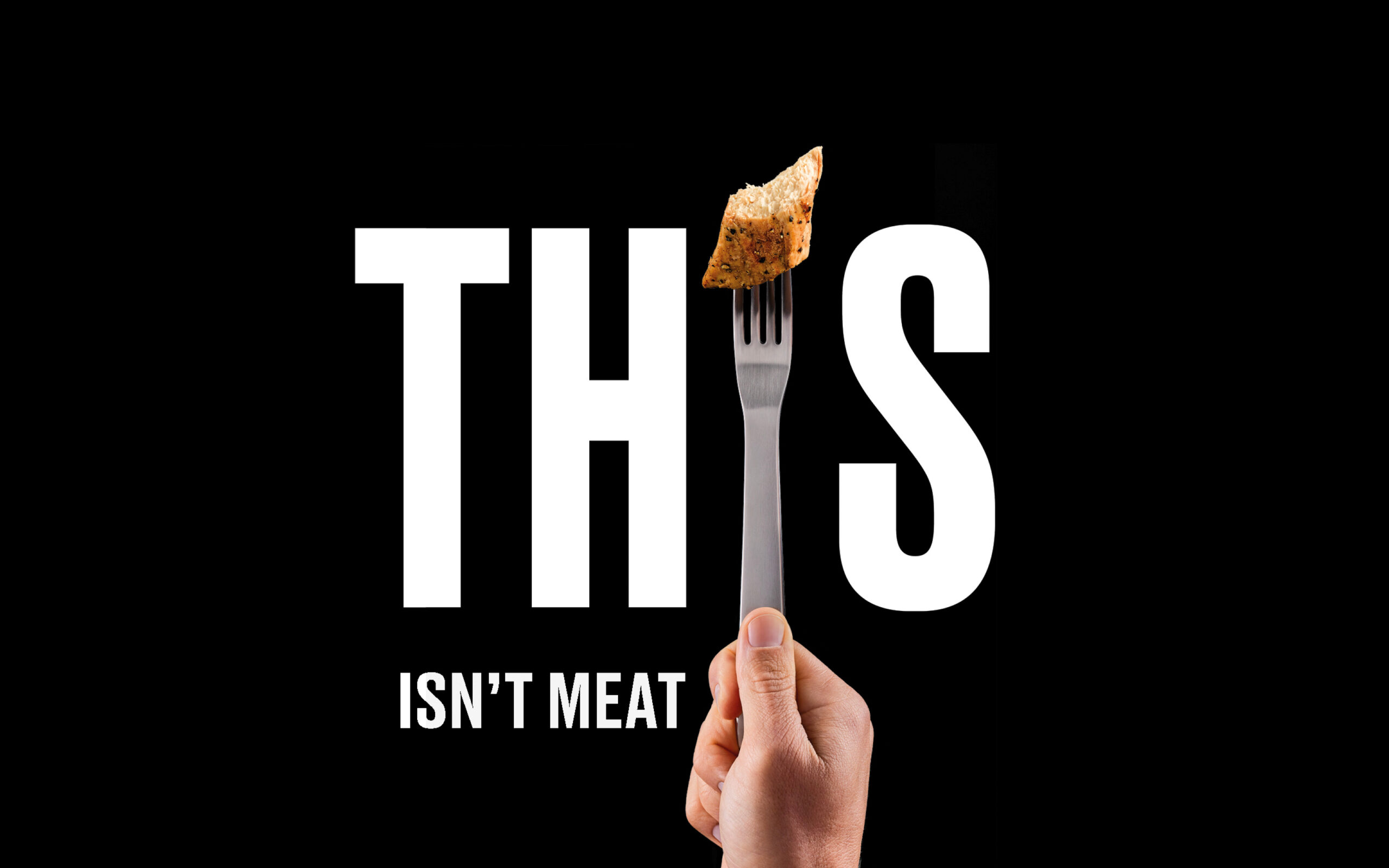
THISBranding, Campaign

Teach FirstBranding

Manchester CollectiveCampaign

Twelve TownBranding

Historic HousesBranding

RecollectBranding